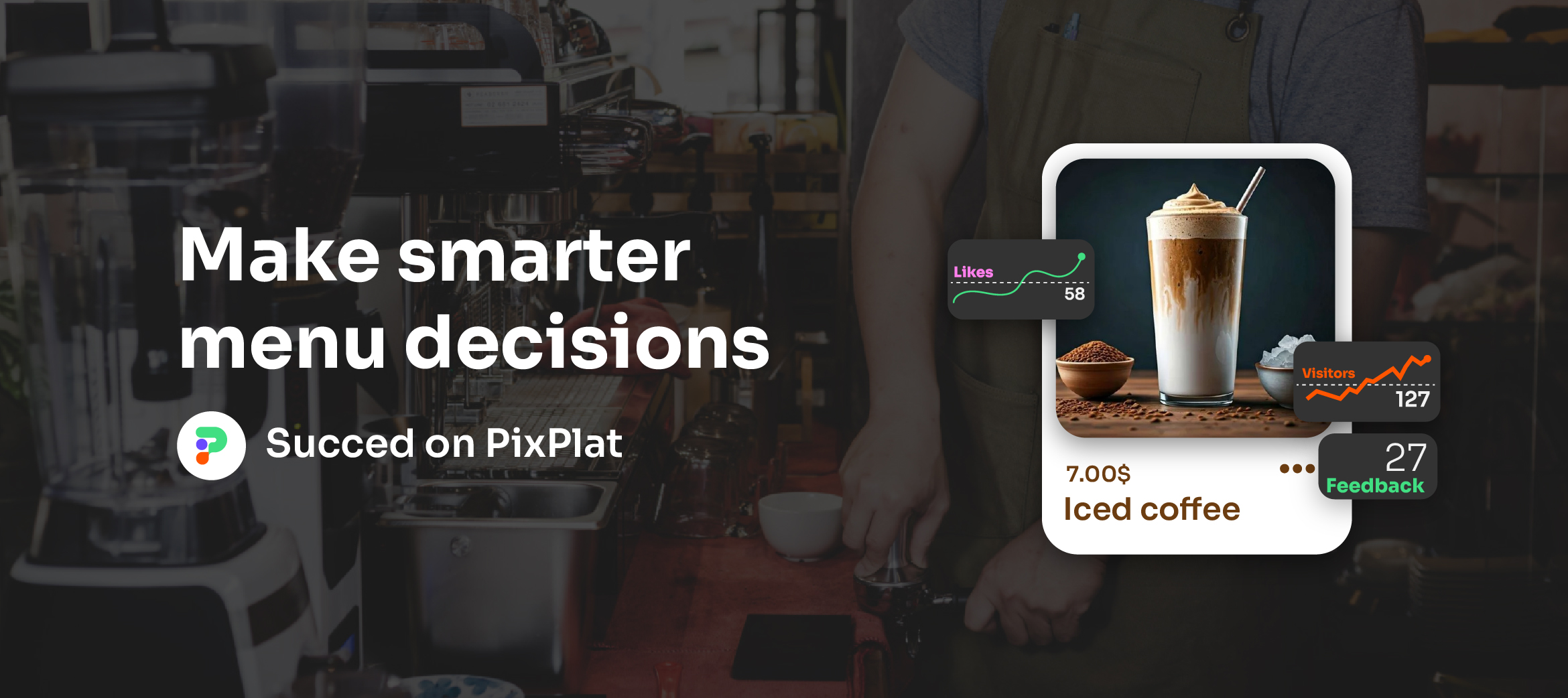
Fonts and Colours That Make a Restaurant Menu Look Professional
How to choose the right typography and colour palette for your restaurant menu — from font pairing rules to colour psychology and digital accessibility standards.
Fonts and Colours That Make a Restaurant Menu Look Professional
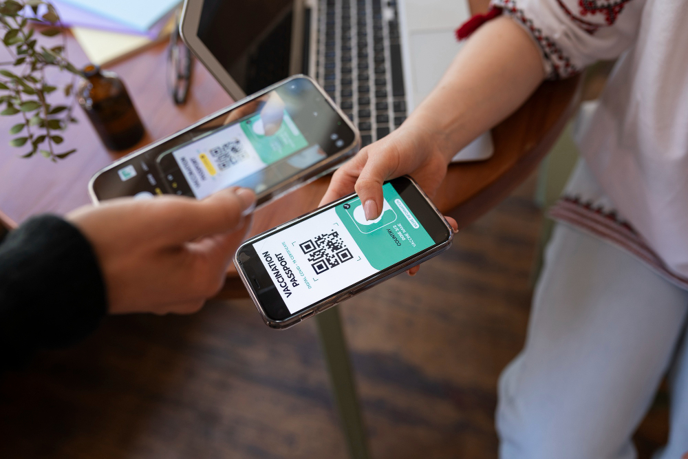
A guest picks up your menu — or opens it on their phone — and forms an opinion before reading a single word. That opinion is formed by your typography and your colours. It happens in milliseconds, and it sets the expectation for everything that follows.
This is not an abstract design principle. Research published in the Journal of Business and Psychology found that menus with more readable fonts lead to longer browsing time — and potentially higher sales. Supercode Typography shapes how quickly guests scan sections, how they interpret pricing, and how they perceive the quality of your food. Choose fonts that feel muddled or generic, and the menu signal doesn't match the food you're serving.
This guide covers the typography and colour decisions that matter most — with the practical rules that prevent the most common mistakes, from font pairing chaos to colour combinations that actively suppress appetite.
Understanding the four font categories — and what each says about your restaurant
Before choosing specific typefaces, you need to understand what each category of font communicates. Fonts have personalities, and those personalities either reinforce your restaurant's identity or contradict it.
Serif fonts — fonts with small decorative strokes at the ends of letterforms — communicate tradition, heritage, and premium quality. Serif fonts suit heritage and fine dining, signal trust and authority, and work especially well for upscale establishments where the experience is about refinement and history. Maplift Classic examples: Garamond, Cormorant, Playfair Display, EB Garamond.
Sans-serif fonts — clean, without decorative strokes — communicate modernity, clarity, and accessibility. They are the most versatile category and the safest choice for digital menus because they render crisply on screens at any size. Examples: Montserrat, Open Sans, Lato, Poppins, Inter.
Script fonts — typefaces that mimic handwriting — communicate warmth, personality, and artisanal quality. They work beautifully for headings and section titles at large sizes. They fail completely as body text: script fonts at small sizes or in long paragraphs become significantly harder to read, especially in low restaurant lighting, and create accessibility barriers for older guests and those with visual impairments. Medium
Display fonts — decorative, distinctive typefaces designed to be used at large sizes for headings or branding — communicate energy, uniqueness, and concept. They should never appear in body text. Use them for your restaurant name or a single category header at most.
Font category | Personality signal | Best used for | Avoid for |
|---|---|---|---|
Serif | Heritage, premium, tradition | Fine dining, wine bars, French bistros | Fast casual, food trucks, bright casual concepts |
Sans-serif | Modern, clear, accessible | All digital menus, casual dining, cafés | Fine dining where elegance is paramount (pair with serif instead) |
Script | Warm, artisanal, personal | Section headers only — never body text | Any text under 18pt, descriptions, prices |
Display | Bold, distinctive, energetic | Restaurant name, hero elements | Anything requiring sustained reading |
The three-font rule — and why most menus violate it
Never use more than three font styles across your entire menu. Using too many typefaces creates visual noise and makes the menu feel disorganised and untrustworthy. Most restaurants do best with one or two font families — hierarchy should come from weight, size, and colour, not from adding new fonts. barkoder
The most effective system for a restaurant menu uses two fonts with clear roles:
Font 1 — Display or script (headers only): Your restaurant name, section headings like "Appetisers" or "From the kitchen." This font carries personality and sets the brand tone. Use it large and sparingly.
Font 2 — Clean sans-serif or readable serif (everything else): Item names, descriptions, prices. This font must be immediately legible at small sizes, in low light, without the guest needing to concentrate. This is not the place for personality — it is the place for clarity.
If you want a third font, use it exclusively as an accent for a specific element, such as special call-out labels ("Chef's pick" or "Seasonal special"). A third font is optional; two is usually better.
The pairing that works for virtually every restaurant: a distinctive serif or script for headers, paired with a clean sans-serif for body text. Examples: Playfair Display (headers) + Lato (body), Cormorant Garamond (headers) + Open Sans (body), any script heading + Montserrat (body).
Typography sizes and hierarchy for digital menus
A digital menu has different constraints than a printed one. Your menu will be read on screens ranging from an older Android phone to a recent iPhone, under restaurant ambient lighting, often while the guest is also scanning the room. The typography has to work in that environment, not in ideal conditions.
The minimum size rules:
WCAG 2.1 AA standards — which govern digital accessibility and are increasingly legally required — specify a minimum contrast ratio of 4.5:1 for normal text. For larger text (18pt/24px or 14pt/18.66px bold), a 3:1 ratio is acceptable. Dev
In practical terms for a digital menu:
Text element | Recommended minimum size | Why |
|---|---|---|
Category headers | 20–24px (15–18pt) | Must be immediately scannable |
Item names | 16–18px (12–14pt) | The primary reading target |
Descriptions | 14–16px (10–12pt) | Readable but not dominant |
Prices | 14–16px — same as or slightly smaller than item name | Should be visible but not command attention |
Allergen labels / badges | 12–14px with high contrast | Must be legible for safety reasons |
The European Accessibility Act (EAA), which came into force in June 2025, now requires digital menus served to EU customers to meet accessibility standards — including adequate text size, sufficient contrast, and flexible display options. Non-compliance risks 'effective, proportionate and dissuasive' penalties. The QR Code Generator
Line spacing matters more on mobile than on desktop. On mobile screens, a line height of 1.5 to 1.8 is appropriate for body text — narrower screens cause more frequent line returns, and inadequate spacing makes readers re-read the same line or skip ahead. Supercode Most digital menu platforms, including PixPlat, apply this automatically through mobile-first CSS.
The X-height variable most designers overlook:
Not all fonts of the same point size read as the same visual size. A font's x-height — the height of its lowercase letters relative to its capitals — determines how large a font appears at a given size. Fonts with tall x-heights (like Open Sans, Lato, or Roboto) read larger and more clearly at small sizes than fonts with low x-heights (like some traditional serifs). For body text on a digital menu, choose fonts with tall x-heights to ensure legibility without requiring large point sizes.
Colour psychology in restaurant menus — the science behind the choices
Colours in a restaurant menu do not just create visual appeal. They trigger physiological and psychological responses that influence how hungry guests feel and how they order.
Warm colours — red, orange, and yellow — stimulate appetite and create a sense of energy and urgency. They are typically associated with food sources in nature and instinctively draw attention to food. This is why fast-food brands overwhelmingly use red and yellow in their branding. FoodyWise
Cool colours — blue and green — create calm and relaxation. Blue in particular is a natural appetite suppressant: there are very few naturally blue foods, and our brains subconsciously associate blue with non-food contexts. Fine dining restaurants sometimes use blue intentionally to slow the pace and encourage guests to linger and spend on wine and dessert. Blend
Consistent use of colour increases brand recognition by up to 80%. Guests may not consciously remember a restaurant's name but will recall its signature colour palette immediately. INFORMS
The colour-by-restaurant-type guide:
Restaurant type | Primary colour palette | Accent | Avoid |
|---|---|---|---|
Fine dining | Deep navy, gold, burgundy, black, ivory | Muted gold or warm ivory for backgrounds | Bright primary colours, neon, heavy red |
Bistro / French café | Warm cream, terracotta, deep red | Forest green, mustard | Cold greys, harsh blue |
Casual / family dining | Warm orange, amber, forest green | Cream or white backgrounds | Blue (appetite suppressor) |
Fast casual | Red, bright yellow, energetic orange | White, clean black | Pastel or muted tones |
Health / vegan / organic | Sage green, earthy olive, natural cream | Light wood tones | Heavy red, neon, fluorescent |
Cocktail bar / upscale | Black, deep charcoal, gold | Rich jewel tones (teal, cobalt) | Primary colours |
Colour contrast — the technical rule that most menus fail
Visual appeal is one dimension of colour choice. Readability is another, and it is non-negotiable.
83.6% of websites have low-contrast text, according to WebAIM's 2024 analysis of the top 1 million websites — making it the single most common accessibility issue online. Scanova Digital menus are no exception. A beautifully dark burgundy background with ivory text may look elegant on a design mockup and fail completely to meet the contrast standards that make it readable for guests with normal vision, let alone those with visual impairments.
The standard to meet: WCAG AA requires a contrast ratio of at least 4.5:1 for normal text and 3:1 for large text (headers). Standard black (#000000) on white (#FFFFFF) achieves 21:1. You have significant latitude, but you must check.
How to check your contrast ratio: Use the free WebAIM Contrast Checker (webaim.org/resources/contrastchecker). Enter your background hex and text hex, and it returns the ratio instantly. Do this for every text/background combination in your menu, including descriptions on your dish photo cards, allergen badges, and any coloured section headers.
Common contrast failures in restaurant menus:
Light grey text on white background (a very common "clean" aesthetic that consistently fails)
Gold or yellow text on cream or ivory backgrounds
White text on medium-brightness coloured backgrounds (the test often fails on these)
Dark text on dark photography without a sufficient overlay
The safe combinations that always work: Dark text on light background. If you want to use a coloured background, add a white or very light translucent overlay behind the text. PixPlat's editor applies contrast-safe defaults automatically, but you can adjust any colour — always run the contrast check before publishing.
How to apply fonts and colours to your PixPlat digital menu
In PixPlat's editor, typography and colour decisions are made in the Style panel, which applies globally across your entire menu — no item-by-item editing required. Changes made here update in the live mobile preview in real time.
For typography:
Set your header font first — this is the brand personality element
Set your body font second — prioritise a clean, tall x-height sans-serif
Confirm minimum sizes: 16px for item names, 14px for descriptions
Never use a script or decorative font for item names or descriptions, regardless of how beautiful it looks in the style panel
For colours:
Start with your background colour — off-white and very light cream work better than pure white for warmth; avoid dark backgrounds unless you're confident in your contrast ratios
Set your primary text colour — near-black (
#1A1A1Aor#222222) on a light background is softer than pure black and equally readableUse your brand accent colour for section headers or the category navigation bar, not for body text
Run the WebAIM contrast check on every combination before publishing
→ For the complete step-by-step guide to building your digital menu, see How to create an online restaurant menu: step-by-step
→ For the full digital menu strategy, see The complete guide to digital menus for restaurants
The five typography and colour mistakes that make menus look unprofessional
1. Using more than three fonts. Every additional font introduces visual inconsistency. If you're tempted to use a fourth font, ask instead whether the same effect could be achieved by changing the weight or size of an existing font.
2. Using a script font for body text. It looks beautiful at 60px. It becomes unreadable at 14px in a dim dining room. Script belongs on category headings and nowhere else.
3. Choosing colours based on what looks good on screen, not in the restaurant. Restaurant lighting is designed for ambience, not readability. Test your digital menu in the actual ambient light of your dining room at service time.
4. Using blue as a dominant colour on a food menu. Blue suppresses appetite. Fine dining can use it intentionally to encourage lingering, but for most restaurants it works against the fundamental goal of making guests feel hungry and excited about the food. Blend
5. Ignoring contrast ratios. A menu that looks sophisticated in the design editor but fails the 4.5:1 contrast test is creating a poor experience for 25% of your guests — those with mild visual impairments, colour blindness, or those simply reading in ambient restaurant lighting.
Frequently asked questions
What are the best fonts for a restaurant menu? The most consistently professional pairing is a readable serif or script font for headers (Playfair Display, Cormorant Garamond, a clean script) combined with a sans-serif for body text (Lato, Open Sans, Poppins, Montserrat). The specific font matters less than two things: legibility at small sizes, and alignment between the font's personality and your restaurant's tone. A bold geometric sans-serif on a fine dining menu creates a disconnect. A flowing script on a fast-casual menu creates confusion. Match font character to restaurant character first, then optimise for readability.
What colours should a restaurant menu avoid? Blue is the primary colour to avoid in food contexts because it functions as a natural appetite suppressant. Blend Pure pink makes savoury food appear less appetising. Overly saturated neon tones of any colour create visual fatigue that makes guests want to put the menu down, not browse it. Black backgrounds can work elegantly but require very careful contrast testing — light text on dark backgrounds often fails WCAG AA standards and looks worse on phone screens in low light than on design mockups.
Does it matter if my menu uses different fonts than my other branding? Yes. Consistent colour use across all touchpoints increases brand recognition by up to 80%. INFORMS The same principle applies to typography. When guests see your menu on PixPlat, your Instagram account, and your window signage, consistent typography builds recognition and trust in a way that a different font choice for each medium never can. Wherever possible, use the same font family or at least the same visual tone across your digital menu, printed menus, and marketing materials.
What font size should I use for a digital menu on mobile? A minimum of 16px (12pt) for item names and 14px (10–11pt) for descriptions. Headers should be 20–24px. These sizes are recommendations from Apple's iOS Human Interface Guidelines and are supported by accessibility research — they account for the reading distance of a phone held in hand under ambient lighting, not the ideal conditions of a design workstation. If in doubt, go larger rather than smaller: no guest has ever complained that a menu was too easy to read.