How to Create an Online Restaurant Menu: Step-by-Step Guide
Learn how to create a professional online restaurant menu from scratch — structure, photos, descriptions, branding and QR code setup. A practical guide for restaurant owners.
How to Create an Online Restaurant Menu: A Step-by-Step Guide
You already know what you want to serve. The question is how to present it in a way that makes guests order more, order faster, and come back again.
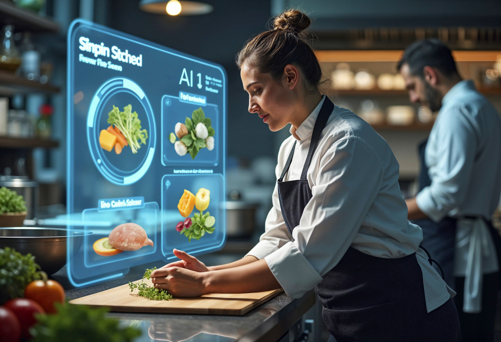
Creating an online restaurant menu is not just a technical exercise — it is one of the most high-leverage decisions you can make for your business. The structure you choose, the words you write, the photos you show or don't show: all of it shapes what guests order and how much they spend. Guests spend an average of only 109 seconds looking at a menu WebstaurantStore, which means every element needs to earn its place.
This guide walks you through the complete process — from choosing a platform to publishing your QR code — and goes beyond the technical steps to cover the design psychology and content strategy that separates menus that convert from menus that are just there.
Before you start: two things to decide
1. What format do you need?
Not all digital menus serve the same purpose. Before building, clarify which of these describes your situation:
Display-only menu — guests scan, browse, but order through a server. This is the entry point for most full-service restaurants and cafés. Lowest barrier to adoption.
Order-enabled menu — guests scan, browse, and place orders directly. Requires integration with your POS or kitchen display. Higher setup effort, higher ROI.
Hybrid menu — QR menu as primary, printed cards available on request. The most common real-world configuration.
For this guide, the focus is the display-only model — the foundation that every restaurant can implement in a single session and that works regardless of your tech stack.
2. What platform will you use?
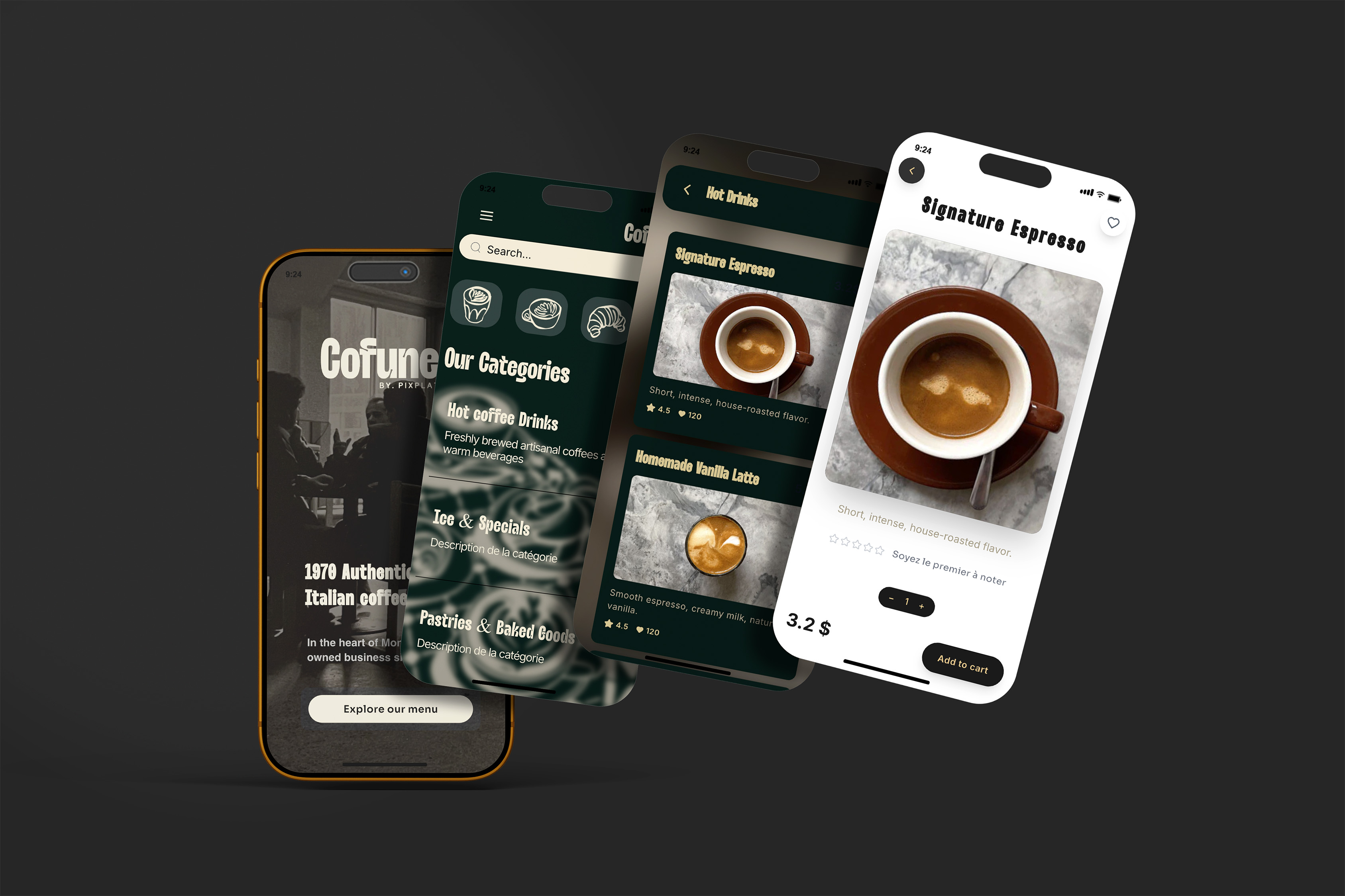
Your platform choice determines your ceiling. Look for four things: a visual editor with mobile preview, real-time updating without republishing, built-in QR code generation, and at minimum basic analytics. PixPlat's drag-and-drop editor was built around exactly these requirements — no developer, no template files, no code.
Step 1 — Map your menu before you touch the editor
The most common mistake when creating an online menu: importing your paper menu structure directly. Paper and screen are read differently. Paper is read linearly; digital menus are navigated by scanning, tapping, and filtering. What works on a laminated card often creates friction on a phone.
Before opening the editor, restructure your menu on paper first.
The right number of categories: Psychologists suggest limiting options per category to around 7 items to avoid the "paradox of choice" — the more options presented, the more anxiety guests feel. WebstaurantStore This translates directly to digital menus: 5 to 7 well-named categories outperform 12 subcategories every time.
Category naming conventions that work on mobile:
Too generic | Better for mobile |
|---|---|
Starters | To share |
Mains | From the kitchen |
Specials | Chef's picks this week |
Drinks | Drinks & cocktails |
Kids | For the little ones |
Clear, specific names reduce decision time and reduce questions to your staff. On a phone, a guest who can't find what they're looking for in two taps will ask a server — or give up.
Decide your hero items before you build. Research shows that when looking at a menu, eyes first move to the centre, then the top right, then the top left — known as the "golden triangle." On a digital menu, the equivalent is the first item in the first visible section. Decide before you start building which two or three dishes should be there.
Step 2 — Build your menu structure in the editor
Open the PixPlat editor and create your categories first — in the order you decided in Step 1. Then add items within each category, working from your most important dishes downward.
For each item, you will fill in four fields:
Name — Short, specific, and evocative. "Hand-cut truffle fries" is better than "Fries (truffle)". The name is the first selling point.
Description — One to two sentences maximum. Descriptive menu copy increases sales by 27%. Generic descriptions like "delicious pasta" don't convert. Sensory, specific descriptions do. Write for the senses: texture, temperature, aroma, origin. "Slow-braised lamb shoulder in rosemary and red wine jus" creates anticipation in a way that "Braised lamb" never will.
Price — Display it clearly, without apology. Studies show that removing currency signs from menus can result in customers spending up to 30% more WISK — but only if you're in a context where that feels natural (upscale dining, prix fixe). For most restaurants, transparent pricing builds trust faster than pricing psychology tricks.
Dietary and allergen badges — Add these at the item level, not as a footnote at the bottom of the menu. Guests with dietary needs scan for badges before reading descriptions. Items with clear V, GF, or VE labels see more orders from that audience because the cognitive work is done for them.
A note on content volume: resist the urge to put everything on the menu. Studies show that a good menu layout can increase sales by up to 15% simply by making items easier to find and highlighting the right dishes. Altametrics A focused menu of 25 well-described items converts better than 60 items with thin descriptions.
Step 3 — Add photos strategically
Photos are the single highest-ROI investment in a digital menu. Restaurants that transition from text-only menus to photo-based menus have reported conversion rate increases of around 25%, and menu items featuring photos can see a 6% higher sales rate compared to those without images. Csconnect
But the quantity and quality of photos matter as much as having them at all.
Which items to photograph first:
Your top 3–5 margin items (not necessarily your bestsellers — the dishes you most need to sell)
Your signature dish or any item that defines your restaurant
Anything with a visual presentation that's hard to describe in words
Your most popular starter and dessert (upsell anchors)
You do not need to photograph everything at once. Starting with 8–10 strong photos and building from there is more effective than rushing 40 mediocre shots into the menu.
How to shoot food photos without a professional photographer:
The gap between a professional shot and a good-enough smartphone shot is smaller than you think if you follow three rules:
Natural light only. Shoot near a window during the day. Never use the phone flash — it flattens the dish and makes food look artificial.
Clean, neutral background. A white plate on a wooden table or a plain linen surface. Clutter competes with the food for attention.
Shoot slightly from above or at a 45-degree angle. This is how most dishes are meant to be seen — from the diner's perspective when it arrives at the table.
Compress images before uploading. Large files slow your menu load, and load speed directly affects completion rates: templates with loading times under 2 seconds recorded 90% completed interactions, while menus that stall lose guests before they've seen a single dish.
Step 4 — Design your menu to match your brand
Your digital menu is a brand surface. A guest who arrives at a white generic template after scanning your QR code has a micro-disconnect — the restaurant they're sitting in and the menu they're holding don't match. That friction is small but real, and it erodes trust in small ways.
In PixPlat's editor, you control:
Color palette — use your brand primary and secondary colors. Keep the background light (dark backgrounds make food photos look muddy and reduce text legibility in restaurant lighting).
Typography — choose fonts that are readable at 14–16px on a small screen. Decorative fonts work for headings; body text needs to be clean and legible.
Logo placement — at the top of the menu, clearly visible. This is the first thing a guest sees when the menu opens.
Section dividers and layout — use white space generously. Crowded menus signal "too many choices" before a guest has read a word.
One practical test: open your menu preview on your own phone under the lighting conditions of your dining room at service time. Not at your desk under white office light — at the table, in the actual environment. Readability problems that are invisible on a bright monitor become obvious in a dimly lit restaurant.
→ For specific guidance on typography and colour choices for restaurant menus, see Fonts and colours that make a restaurant menu look professional
Step 5 — Write descriptions that actually sell
This step is skipped or rushed by almost every restaurant that builds a digital menu. It's also the step with the highest return on time invested.
The principles of sensory menu copy apply directly to digital menus. Smart menu descriptions use descriptive language to justify higher prices: "Grass-fed New Zealand lamb, slow-braised for 8 hours in a bold red wine reduction" commands a higher price point than "Braised lamb."
A practical framework for writing each item description:
State the key ingredient or technique first. Guests scan for the main thing — the protein, the preparation method, the defining ingredient. "Pan-seared Scottish salmon" tells the guest more in four words than "A delicious salmon dish with vegetables and sauce."
Add one sensory detail. Choose texture, temperature, or aroma: crispy, slow-roasted, rich, aromatic, chilled. One sensory word is enough to shift a description from functional to evocative.
End with the serving suggestion or pairing. "Served with roasted cherry tomatoes and basil oil" closes the description and completes the mental picture.
What to avoid:
Superlatives without specificity ("our amazing house special" — amazing how? compared to what?)
Overly long descriptions that make the guest work to find what they need
Technical culinary jargon that a non-professional diner won't understand
Describing the price or portion implicitly through language ("generous portion of..." signals that the price needs defending)
Using sensory words like "oak-smoked" can boost sales by 27%, while placing a high-priced item next to a "star" item makes it look like a deal — the anchoring effect. On a digital menu, you can use this deliberately: place your highest-margin item at the top of a section, and it anchors the price perception for everything below it.
Step 6 — Configure your QR code
Once your menu is published, PixPlat generates your QR code automatically. At this stage, customise it before printing:
Add your logo to the centre of the code
Match colours to your brand palette
Add a frame with a clear call to action: "Scan to view our menu" or "View our full menu here"
Export at print resolution — minimum 4 × 4 cm for table scanning reliability
A branded QR code is not decoration. It is the first visual element a guest sees when they arrive at the table. An unbranded black grid says nothing. A code with your logo and colours tells the guest, before they've even scanned, that the experience on the other side was built with care.
→ For the complete QR code setup and placement guide, see QR code menu for restaurants: how it works and how to set it up
Step 7 — Test before going live
Run through this checklist before placing a single QR code on a table:
Test | What to check |
|---|---|
Scan from table distance | Works at 30–50cm, slight downward angle |
iOS and Android | Menu opens correctly on both |
Lighting conditions | Readable in your actual dining room at service time |
Load speed | Full menu loads in under 3 seconds on mobile data |
All sections and items | No missing photos, broken text, or empty descriptions |
Allergen badges | Display correctly on all items that need them |
Category navigation | Guest can reach any item in 2 taps or fewer |
Pricing | All prices accurate and visible |
This test takes about 15 minutes. It saves you from a week of guests complaining about a menu that doesn't scan, a photo that won't load, or a price that was never updated from your original draft.
Step 8 — Publish, place, and monitor
Go live. Place your QR codes — on table tents, at the entrance, and on takeaway packaging if applicable. Brief your team on how to introduce the menu to first-time users.
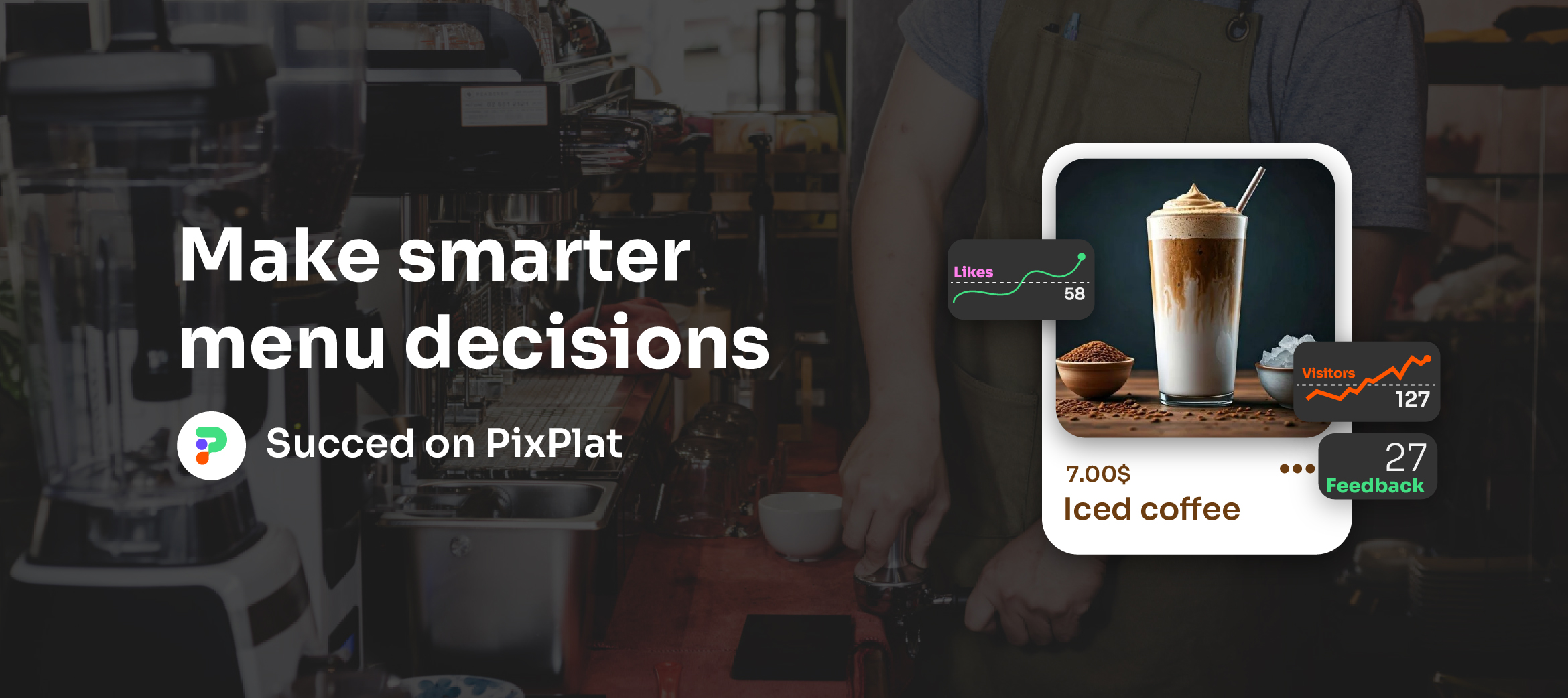
Then, after 7 to 10 days, check your analytics. PixPlat's dashboard shows you which sections get the most views, when your menu traffic peaks, and how guests navigate. This data is not an abstract dashboard to admire — it is a weekly signal telling you what to adjust.
Restaurants that update their menus quarterly see 15–30% increases in customer excitement and return rate. A digital menu makes quarterly updates a 30-minute task, not a $500 reprint job. Use that advantage.
The most common improvements to make after your first month:
Move your most-viewed dish to the top of its section if it isn't already there
Improve descriptions on items with high view rates but low order rates
Add photos to the two or three items that currently have none
Remove or consolidate any section that consistently has the lowest dwell time
→ For a complete guide to what to measure and how to act on the data, see Restaurant menu analytics: understanding your customers
The six most common mistakes when creating an online restaurant menu
1. Copying the paper menu structure directly. Digital navigation is not linear. Restructure categories for scanning and tapping before you build.
2. No photos, or poor-quality photos. A blurry photo hurts more than no photo. Either shoot well or leave the field empty until you can.
3. Generic descriptions. "Delicious grilled chicken" tells the guest nothing. Specific, sensory language sells.
4. Too many categories. Seven or fewer is the target. More than that, and guests give up navigating.
5. No branding in the QR code. An unbranded code looks untrustworthy. Spend five minutes adding your logo and colours before printing.
6. Never updating after launch. A digital menu that goes stale — sold-out dishes still showing, seasonal items from three months ago still visible — creates a worse experience than a printed menu.
How long does it take?
This is the question every restaurant owner asks, and the honest answer is: it depends entirely on how prepared your content is.
Content readiness | Time to publish |
|---|---|
Menu structured, descriptions written, photos ready | 45–90 minutes |
Menu structured, no descriptions, some photos | 2–3 hours |
Starting from scratch, need to write and shoot | Half a day |
Using PixPlat's template library as a starting point | Faster at every stage |
The platform sets the ceiling. PixPlat's editor is built for speed — you can see a live mobile preview as you build, which eliminates the back-and-forth of upload, check, adjust, re-upload that slows down most first builds.
→ See PixPlat's menu templates and start building → Read the complete guide to digital menus for restaurants
Frequently asked questions about creating an online restaurant menu
Do I need technical skills to build a digital menu? |
|---|
No. PixPlat's editor works on a drag-and-drop model — you build visually, see the result in real time on a mobile preview, and publish with one click. No code, no file uploads, no developer required. The constraint is content — having your dishes, descriptions, and photos ready — not technology. |
Can I update my online menu after publishing it? |
Yes, and this is one of the core advantages over printed menus. Every change you make in the editor is live the moment you save it. Update a price at 5pm before service; every guest who scans after that sees the new price. Remove a dish when it sells out; it disappears from the menu immediately without reprinting anything. |
How many items should my digital menu have? |
There is no universal answer, but limiting categories to around 7 items prevents decision paralysis, and most successful digital menus have between 20 and 50 items in total. More than 60 items on a mobile-optimised menu tends to overwhelm guests and increase time-to-order, which creates pressure on your team during busy service. |
Should I offer a physical menu alongside the QR code? |
For most full-service restaurants, yes — at least during the first few months. Keep 3 to 5 laminated backup menus and offer them proactively to guests who appear hesitant. A digital menu should include everyone, not create friction for those who prefer paper. Over time, most restaurants find that physical menu requests decline to near zero as guests become comfortable with the QR experience. |