How to Choose the Best Photos for Your Restaurant Menu
Which dishes to photograph first, what angles to use, and how to shoot quality food photos without a professional photographer. A practical guide for restaurant owners.
How to Choose the Best Photos for Your Restaurant Menu
The first thing a guest does when they open your digital menu is scroll for images. Not descriptions. Not prices. Images.
This is not a minor behavioural quirk — it is the primary decision driver. 84% of diners want to see photos of food and drinks before choosing a restaurant, and 65% say those visuals heavily influence where they decide to eat. FoodShot AI When a dish has a photo, the guest's decision is informed and confident. When it doesn't, they rely on a description that most will skim in under three seconds.
The case for food photography on your digital menu is airtight. What most guides miss is the strategic layer: which photos to take first, how to angle each dish for maximum appetite appeal, and what separates a photo that sells from a photo that silently damages your brand.
The financial case: photos don't just look nice, they sell
Before getting into technique, the numbers are worth understanding because they explain every decision that follows.
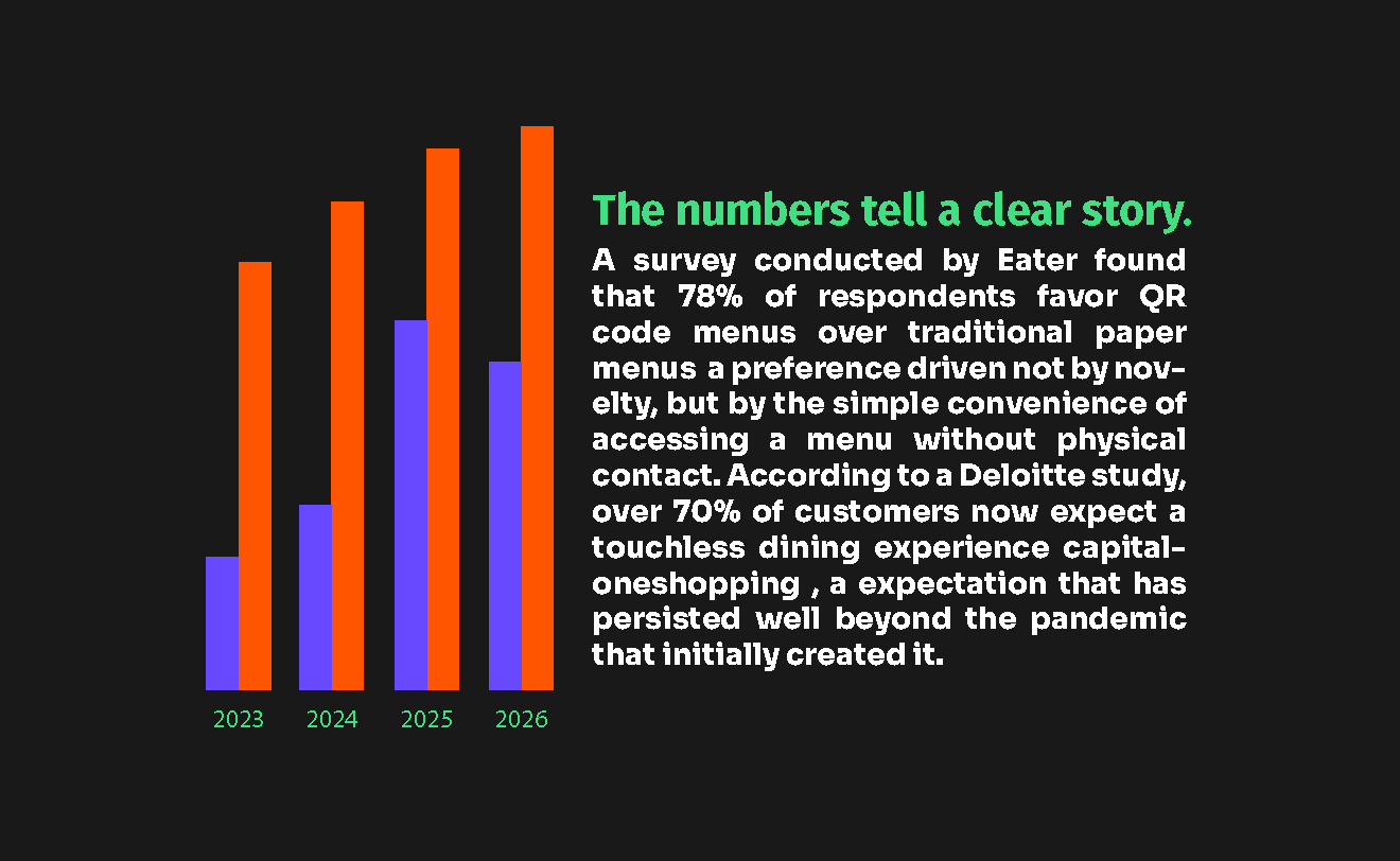
Menus with professional photography increase sales by 20–45%. Marketing LTB Data from a study of 15,000 small restaurants found that menus with item photos generate up to 44% more monthly sales. On delivery platforms specifically, high-quality food photography can increase orders by 35%. GoFoodservice
These are not marginal improvements. A restaurant doing €15,000 per month in digital menu orders that adds quality photography to their items is not adding a nice-to-have — they are potentially adding €3,000 to €6,000 in monthly revenue without changing a single dish.
The mechanism is straightforward. Guests who can see a dish experience what researchers call "visual hunger" — a genuine physiological response to an appealing food image that creates a desire to order. Guests who cannot see a dish face uncertainty, and uncertainty produces conservative ordering behaviour. They choose what they know rather than what might be excellent.
Quality matters more than quantity: a low-quality photo does more harm than no photo at all. Poorly lit, blurry, or unappealing images signal low quality and reduce the perceived value of the dish. GoFoodservice
That last point is the most important and the most frequently ignored. A photo of your pasta dish under restaurant fluorescent lighting, taken with a phone flash, slightly out of focus — that photo is worse than an empty image slot. It tells the guest that you don't care about presentation. They extend that judgment to the food itself.
Step 1 — Decide what to photograph first
Most restaurant owners try to photograph everything at once and end up with a rushed shoot, inconsistent quality, and fifty mediocre images instead of twenty excellent ones.
The right approach is strategic sequencing: photograph the items that will deliver the most return, in the right order, before worrying about completeness.
The four-category prioritisation framework:
On digital menus, every item should eventually have a photo because online guests rely on visuals as their primary decision tool. But if budget or time is limited, focus on professional food photography for your top items and ensure your layout follows best practices — with high-margin items in high-attention positions. GoFoodservice
Priority | What to photograph | Why |
|---|---|---|
1st | Your 3–5 highest-margin dishes (your "stars") | Photos drive these items directly into guests' consideration |
2nd | Your signature dish or any item that defines your restaurant | Brand identity and first impression |
3rd | Top-selling starter and dessert | Upsell anchors — the items guests need to "see" to order |
4th | Any item with a visual presentation that descriptions struggle to capture | Removes the uncertainty that keeps it unordered |
Last | Everything else | Consistency matters, but ROI diminishes quickly |
The goal of week one is not a complete photo menu. It's ten excellent photos of your most important dishes. Add more over time. An incomplete menu with ten outstanding photos outperforms a complete menu with fifty average ones.
Step 2 — Match the camera angle to the dish
This is the most technical decision in food photography, and it's also the most commonly botched. Restaurants photograph their entire menu at 45 degrees and wonder why some dishes look flat or underwhelming.
The rule is simple: the angle should showcase the dish's strongest visual feature. Every dish has one — height, surface pattern, layers, texture, colour. Your job is to find the angle that reveals it.
The three primary angles and when to use each:
The key question to ask yourself before every shot is: what is the most visually interesting feature of this dish? If it is the surface arrangement, go overhead. If it is the layers and height, go straight-on. If you want a natural, inviting look, go 45 degrees. Platora
Angle | Best for | Not for |
|---|---|---|
Overhead (90°) | Pizza, salads, charcuterie boards, flat breads, grain bowls, pancakes, desserts with decorated surfaces | Burgers, sandwiches, stacked dishes, drinks — any dish where height is the selling point |
45° (diner's perspective) | Plated entrées, pasta, curry, most soups, most rice dishes | Anything that looks better from above or requires showing full height |
Straight-on (eye-level) | Burgers, sandwiches, layer cakes, tall cocktails, parfaits, stacked pancakes | Flat dishes — they become a single line from eye level |
The 45° angle works for approximately 70% of all menu items and mimics the most natural viewing perspective — it is the default when in doubt. Choosing the wrong angle is one of the most common restaurant photography mistakes: a flat pizza shot from eye level looks like a line. A tall burger shot from overhead loses its impressive height. ImageSystems
A practical rule: before shooting, hold the dish at eye level and look at it from each angle. Which angle makes you want to eat it? That is the angle.
Category-specific angle guide:
Dish category | Recommended angle | Rationale |
|---|---|---|
Pizzas, flatbreads, salads | Overhead | Surface design and colour distribution is the visual |
Burgers, sandwiches | Straight-on (0°) | Layers and height are the selling point |
Pasta, curries, stews | 45° | Shows sauce, texture and plating together |
Soups, ramen, bowls | 45° or three-quarter | Reveals surface garnish without losing bowl depth |
Layer cakes, parfaits, cocktails | Straight-on | Height and layers need to be visible |
Appetiser platters, sharing boards | Overhead | Full spread of variety is the selling point |
Grilled mains (steak, fish) | 45° | Grill marks, sauces and side dishes all visible |
Step 3 — Get the lighting right without professional equipment
Lighting is responsible for 80% of the quality difference between a professional-looking food photo and an amateur one. Equipment contributes far less than most restaurant owners believe.
The single most important rule: use natural indirect light
Natural window light provides the most appealing food photography. Position your dish 2–3 feet from a large window with indirect sunlight. Avoid direct harsh sunlight and fluorescent kitchen lighting, which creates unflattering colour casts and hard shadows. MenuCapture
Indirect window light — light that has passed through clouds or entered through a window not in direct sun — wraps around your food softly. It reveals texture, enhances colour accuracy, and produces the gentle shadows that give dishes their three-dimensional appeal.
What never to do:
Use the phone flash. It flattens the dish, creates harsh shadows, and makes sauces look greasy
Shoot under fluorescent kitchen lights. They cast a yellow-green tint that makes food look unappetising
Mix light sources. Overhead kitchen light plus window light creates competing colour temperatures that are nearly impossible to correct in editing
The $3 fix that changes everything
A white foam board (A3 size from any stationery shop) placed on the shadow side of your dish reflects the window light back into the darker areas of the plate. This eliminates the harsh one-sided shadows that make many restaurant photos look amateurish. It costs three euros and produces results that would otherwise require a professional reflector setup.
Shooting schedule
Late morning or early afternoon typically offers the best soft, diffused light — especially if you are shooting near a window. ChowNow If you are shooting over multiple days, shoot at the same time each day. Light consistency is as important as any other consistency decision in your photo set.
Step 4 — Style the dish before you shoot
Styling is not deception. It is presenting the dish at its best, in the same way that plating is a skill in the kitchen. A properly styled dish is still your dish — you are simply making sure the photo communicates what makes it worth ordering.
Practical styling decisions that take under two minutes each:
Background and surface. Clean, simple, and consistent across your shoot. A white plate, a wooden surface, a slate board, or a light marble — pick one and use it for all dishes in the same category. Consistency is what separates professional restaurant menus from amateur ones. Pick one background and use it for every shot. Having two backgrounds (one for entrées, one for desserts) is fine, but more than that creates visual chaos.
Timing. Photograph food immediately after plating while it still has steam and a fresh appearance. Use a slightly damp paper towel to add shine to sauces and remove any spills or fingerprints from plates. Dishes change appearance within minutes of plating — sauces sink, garnishes wilt, steam disappears. Have your shot setup ready before the dish is plated, not after.
Portions. Photograph a representative portion — not the smallest you serve and not an inflated one. The photograph creates an expectation. When the dish arrives at the table, it should match what the guest saw. Portion mismatch is one of the most common sources of negative online reviews.
Props and context. One or two supporting elements — a fork, a linen napkin, a small sauce dish — can add scale and naturalness to a photograph. More than that creates visual noise that competes with the food. The rule is: every prop should earn its place by supporting the story of the dish. If removing it makes the photo worse, it stays. If removing it changes nothing, remove it.
Colour contrast. Food looks more appetising when there is colour contrast. If your dish is mostly one colour, add a colourful garnish or serve it on a contrasting plate. White plates work well for most foods because they make colours pop.
Step 5 — Maintain consistency across your entire menu
Individual great photos are not enough. Your menu needs to look like a curated collection, not a random assortment.
Guests scan a digital menu and, consciously or not, evaluate the overall visual coherence before they assess individual dishes. A menu where half the photos were shot in natural light and half under fluorescent kitchen lights — even if each photo is technically decent — communicates a lack of intention that guests extend to their overall assessment of the restaurant.
The four consistency decisions to make before you start:
Lighting direction — always from the same side (left or right window)
Background surface — the same one or two surfaces for all dishes of the same category
Camera angle per category — all burgers straight-on, all salads overhead, all mains at 45°
Colour temperature — the same warmth setting across every image (consistent editing)
Create a one-page style guide. Before your shoot, write down: lighting direction, background surface, camera angle per category, prop list, and distance from dish. Print it out and keep it visible during the shoot. This document is worth more than any piece of equipment you will use.
Step 6 — Know when to use a professional photographer
The smartphone approach works well for digital menus, social media, and delivery platforms. There are moments when a professional is worth the investment.
Professional food photographers bring lighting equipment, food styling skills, and post-production expertise. Expect to pay $750–$2,000 for a session covering 10–15 dishes, or $3,000–$5,000 and above for a full 50-item menu.
When to hire a professional:
Your restaurant opening campaign — the first images that define public perception
A full menu redesign where all photos need to be replaced simultaneously
Any promotional campaign for printed materials (posters, press coverage, outdoor advertising)
A signature dish you want to feature prominently in marketing
When a smartphone approach is appropriate:
Adding photos to existing menu items progressively
New seasonal dishes that need photos quickly
Social media content for specials and promotions
PixPlat digital menu where the display context is mobile and the bar for "good enough" is realistic
The question is not professional vs smartphone — it is professional vs nothing. A well-shot smartphone photo in good natural light with proper styling always beats waiting for a professional session that may be weeks away.
The four photo mistakes that cost you sales every day
1. Using the phone flash. Flash creates flat, harsh images that make every dish look like it was photographed for an insurance claim. There is no lighting scenario where the phone flash produces a better result than natural window light.
2. Shooting when the dish is cold. The steam is gone, the sauce has settled flat, the garnish has wilted. This is not the dish your guests will receive. Photograph at the moment of service, not after.
3. Inconsistent backgrounds. A menu where every photo has a different background is visually chaotic. Pick one surface. Keep it.
4. Misrepresenting portion size. A guest who orders based on a generous-looking photo and receives a smaller portion is a guest who leaves a one-star review. Accuracy in portion representation is not just ethical — it is a customer retention decision.
The connection to your digital menu strategy
The photographs you choose for your menu are not just visual decoration — they are the primary sales lever on your digital menu page. Every item with a high-quality photo has a better chance of being ordered than every item without one, regardless of how well written the description is.
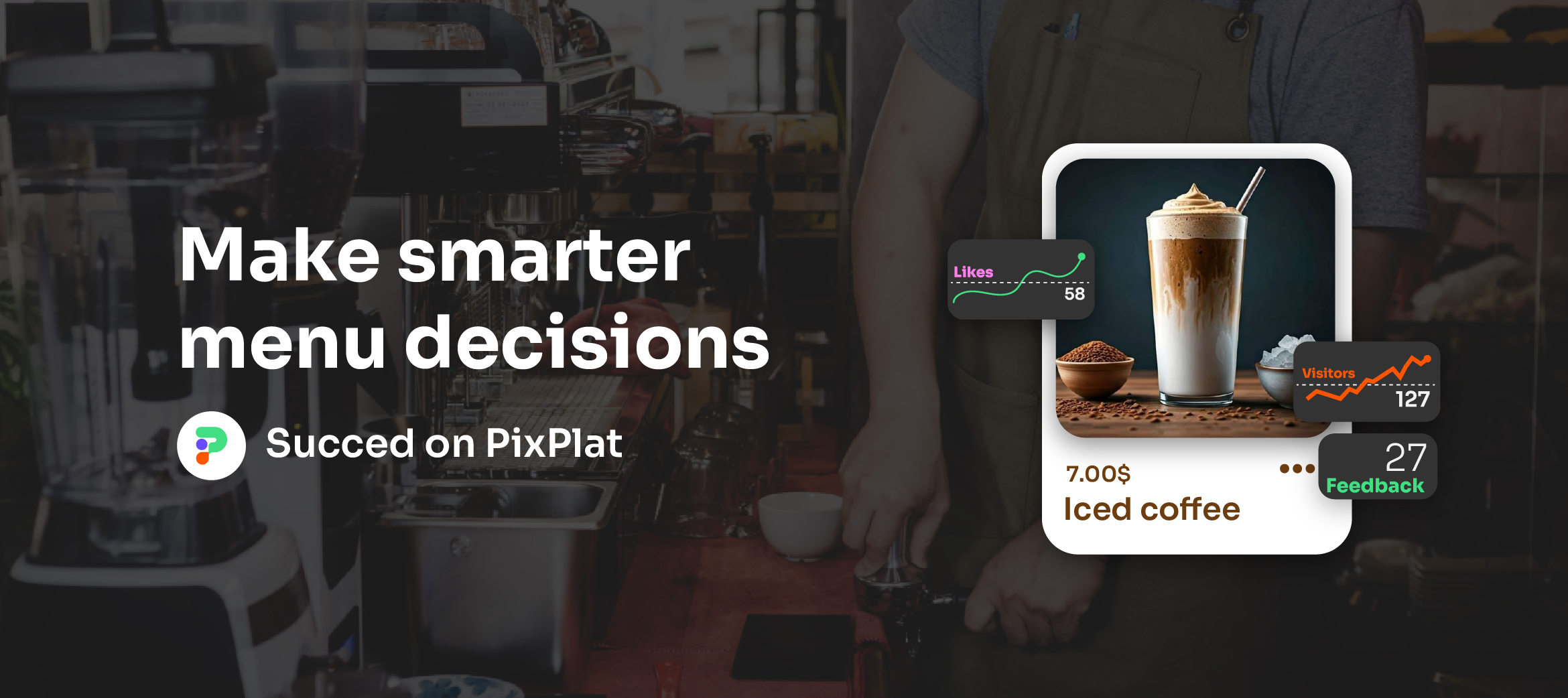
On PixPlat, photos are uploaded directly to each menu item in the editor, with a live mobile preview so you can see exactly how each dish will appear to a guest before publishing. There is no file size limit on quality, and the platform compresses images automatically for fast loading without degrading visual quality.
→ For the complete guide to building your digital menu, including how to structure categories and write descriptions that sell, see How to create an online restaurant menu: step-by-step
→ For the full strategy on digital menus for restaurants, see The complete guide to digital menus for restaurants

Frequently asked questions
Do I need a professional photographer to take good menu photos?
No — not for a digital menu. Modern smartphones produce excellent quality when used with proper lighting (natural indirect window light) and basic styling. The gap between a smartphone shot with technique and a professional shot is real, but for most digital menu contexts, a well-executed smartphone photo is entirely sufficient. The gap between any good photo and no photo is far larger and far more commercially significant.
Should every item on my menu have a photo?
On a digital menu, yes — eventually. Guests use photos as their primary decision tool when browsing online. Items without photos are significantly less likely to be ordered than items with photos, even when descriptions are good. Prioritise photographing your highest-margin and signature items first, then work towards complete coverage over time.
What background works best for restaurant food photography?
White plates, light wooden surfaces, neutral slate, or clean marble are the most versatile and work across the widest range of dishes. The background should complement the dish, not compete with it. Choose one background and use it consistently across your shoot — this consistency is more important than the specific surface you choose.
Can a bad photo actually hurt sales compared to having no photo?
Yes. A low-quality photo does more harm than no photo at all. Poorly lit, blurry, or unappealing images signal low quality and reduce the perceived value of the dish. GoFoodservice If your existing photos were taken with flash, under fluorescent light, or at an angle that makes the dish look unappetising, removing them temporarily while you reshoot is a better short-term decision than leaving them in place.