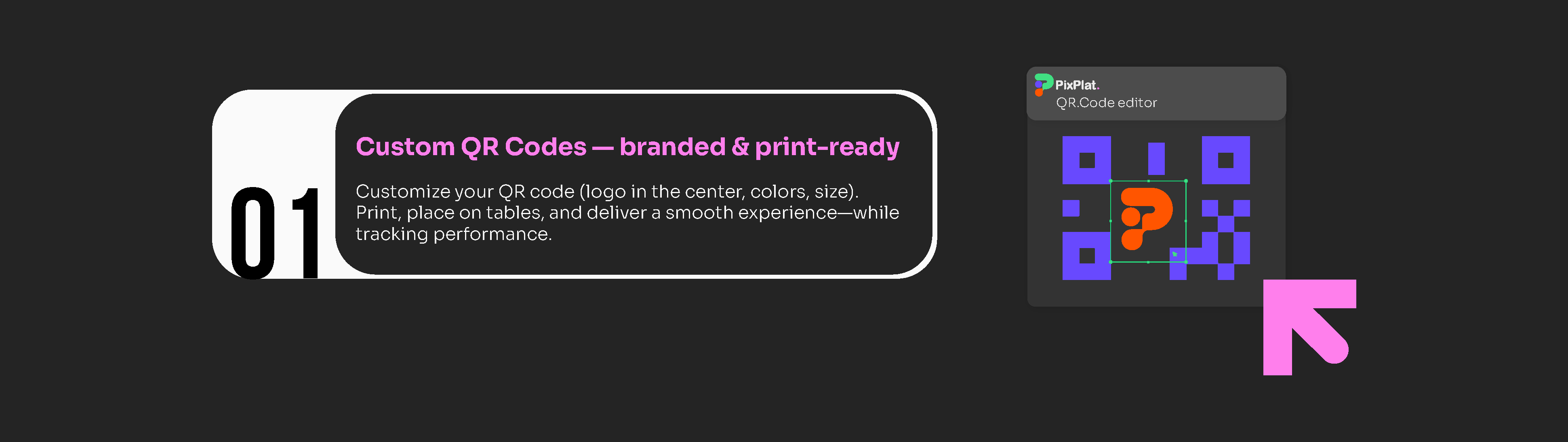
How to Customise Your QR Code to Match Your Restaurant Brand
Step-by-step guide to branding your restaurant QR code — colours, logo, frame, CTA text, and the technical rules that keep it scannable every time.
How to Customise Your QR Code to Match Your Restaurant Brand
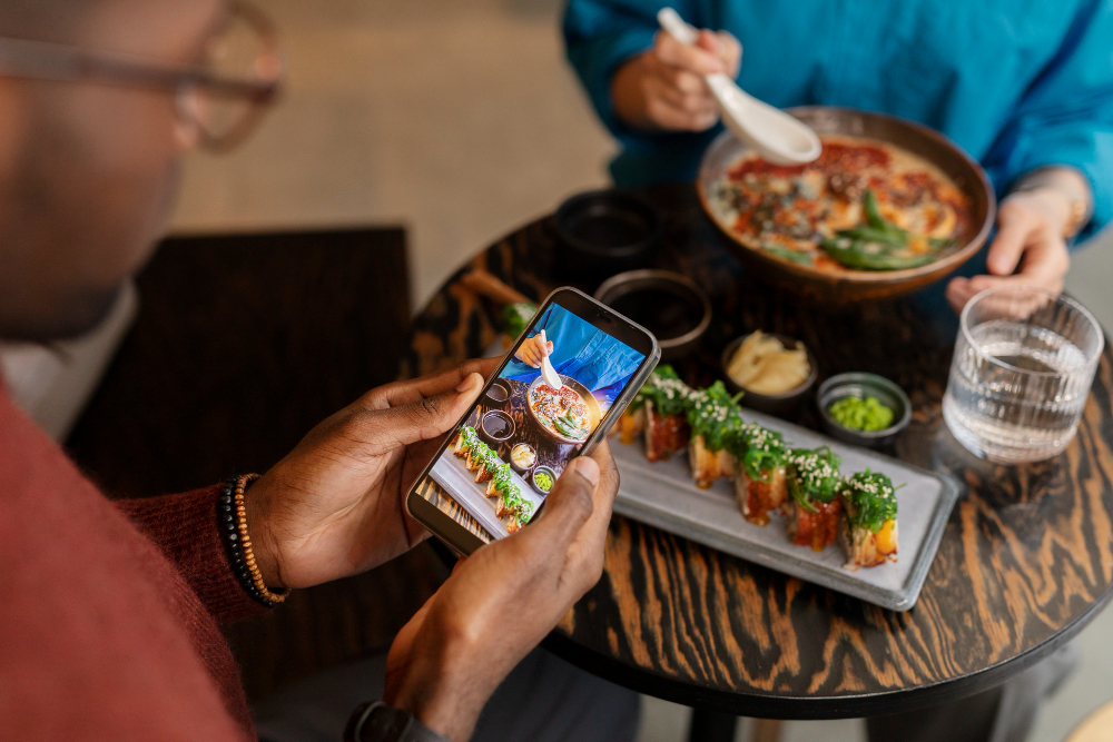
Most restaurants generate a QR code, download it in black and white, and stick it on a table tent. That works. But it wastes one of the clearest opportunities to reinforce your brand at the exact moment a guest is paying attention.
The QR code is the first digital touchpoint in every guest's experience. Before they see your menu design, before they read a dish description, they see that square on the table. A generic black grid says nothing about your restaurant. A code with your logo, your colours, and a clear instruction tells a guest — before they've even scanned — that what's on the other side was built with care.
This guide covers every customisation decision for your restaurant's QR code: colour, logo, frame, call to action, and the technical constraints that keep a beautifully designed code actually scannable.
Why customisation is a performance variable, not just aesthetics
The business case for branding your QR code is measurable.
Studies show that beautifully designed QR codes with a brand logo are scanned up to 80% more often than standard black-and-white ones. ViralQR That figure reflects something intuitive: a guest who sees your logo in the centre of a code recognises it as intentional and official. An unbranded black grid triggers a subconscious question — is this legitimate, or is it a generic code printed by whoever owns this table tent?
49% of marketers say that adding a business logo to their QR code design is the most valuable aspect of QR code customisation, citing not just brand awareness but reassurance of reliability and trustworthiness for potential scanners. Bitly
A 2025 MobileIron survey found that 82% of consumers now feel comfortable scanning QR codes from businesses they recognise, up from 53% in 2021. For unknown businesses, the trust rate is lower at 47%, highlighting the importance of branded, well-placed QR codes with clear context about what scanning will do. ScanQueue
In a restaurant context, that trust gap matters. A guest who hesitates to scan your code asks a server instead — adding a step to service and defeating the operational purpose of the QR menu entirely.
Custom QR codes see scan rates 30–45% higher than generic codes, according to Supercode data. Supercode
The elements you can customise — and what each one does
A QR code has four distinct visual components, each customisable independently:
Element | What it is | What you can change |
|---|---|---|
Modules | The dark squares that encode the data | Colour, shape (square, round, dot), size |
Eyes | The three large square patterns in the corners | Outer shape, inner shape, colour (can differ from modules) |
Background | The light area behind the code | Colour (must remain light) |
Frame | The border surrounding the code | Colour, shape, text (call to action) |
On PixPlat's QR editor, all four of these are editable in the same session you generate your code — no separate tool, no export-and-reimport workflow.
Step 1 — Set your module colour using your brand palette
The modules are the small dark squares that carry your data. Changing their colour to a brand colour is the most visible customisation and the one most likely to create scanning problems if done without understanding the underlying constraint.
The rule the scanner follows — and most guides skip over
A QR code scanner does not see colour. It converts the image to greyscale and looks for high contrast between dark areas (modules) and light areas (background). The key insight is that a scanner doesn't care if your code is blue on white or navy on cream — what it cares about is whether the dark and light areas are sufficiently different in brightness. Mypalettetool
This has a practical consequence: the "colour" of your modules is almost irrelevant. What matters is the luminance — the perceived brightness — of that colour.
The contrast ratio requirement
The technical standard (ISO/IEC 18004) specifies a minimum contrast ratio of 3:1 between modules and background. For optimal reliability across all devices and lighting conditions, aim for 4.5:1 or higher — the same standard used for web accessibility (WCAG AA). Standard black on white achieves 21:1. Gocreateqr
You can verify any colour combination using a free WCAG Contrast Checker online — enter the hex codes of your module colour and background, and it returns the ratio instantly.
Brand colours that work reliably as module colours:
Deep navy (
#0D2B55and similar)Forest green (
#1A5C2Aand similar)Burgundy / dark red (
#6B1A1Aand similar)Dark chocolate brown (
#3D1F00and similar)Dark purple (
#3D0066and similar)
Brand colours that consistently cause scan failures:
Yellow (any shade) — too light against a white background
Light blue, sky blue, baby blue — insufficient luminance contrast
Pastel pink, pastel green, pastel any colour — same problem
Pure red or orange — many mobile sensors have difficulty "seeing" red and orange wavelengths as dark modules, causing the code to effectively "disappear" when viewed through a camera lens, especially in warm lighting. Pageloot
The test is simple: if you can't see your module colour clearly against white on a greyscale image, the scanner probably can't either.
Keeping your background white
Even if your brand uses a coloured background in marketing materials, keep your QR code background white or very close to it. A coloured background reduces the contrast ratio from both sides simultaneously and dramatically increases failure rates. Reserve the colour for the frame and the surrounding table tent design — not for the code itself.
Step 2 — Add your logo to the centre
Adding your logo is the single most trust-building customisation available. It answers the "is this legitimate?" question before a guest has consciously asked it.
The error correction requirement
When you place a logo in the centre of a QR code, you are physically covering part of the data. The code remains scannable because of built-in error correction — a mathematical redundancy system that allows scanners to reconstruct missing data. There are four levels:
Level | Recovery capacity | When to use |
|---|---|---|
L (Low) | 7% damage tolerance | Digital screens only |
M (Medium) | 15% | Clean print, no logo |
Q (Quartile) | 25% | Moderate wear, small logo |
H (High) | 30% | Always use with a logo |
A logo placed in the centre of a QR code typically covers 10 to 20% of the total module area. Level H (30% recovery) provides sufficient headroom above the coverage to guarantee a reliable read. Level M may work if the logo is very small, but offers no margin for additional damage like scratches or fading. QR-Verse
On PixPlat, error correction adjusts to Level H automatically the moment you add a logo — you don't need to configure this manually.
Logo size and positioning
Keep your logo at 20–25% of the total code width. Larger than that and you begin encroaching on the finder patterns — the three large squares in the corners that tell the scanner how to orient itself. Those must never be obscured. The logo should be centered and not extend to the code's functional patterns (finder squares, alignment patterns). Maximum safe logo coverage is approximately 30% with Level H — stay under 25% for reliable scanning. QR Code Maker
Logo format for best results
Upload your logo in PNG with a transparent background, or SVG if your generator accepts vector files. A transparent background allows the QR code's light background to show through the logo's edges cleanly, without a white square box around it. If your logo has a complex shape or detailed fine lines, simplify it — at the small size it will appear in the code, fine detail becomes noise.
Step 3 — Style the corner eyes
The three finder patterns (called "eyes") in the corners of a QR code can be styled independently from the modules. This is one of the subtler customisation options and one of the most effective for giving a code a distinctive, branded feel without compromising function.
Most generators let you choose:
Outer eye shape — square (default), rounded square, circle, extra-rounded
Inner eye shape — square, rounded, dot
Eye colour — can match your module colour, or use a contrasting accent colour from your palette
For a restaurant context, the most versatile approach is: rounded outer eyes in your brand's primary dark colour, and the standard inner square in the same colour or a slightly darker shade. This produces a code that feels designed without becoming so decorative that it distracts from the overall table tent composition.
For dining environments, QR codes on table stands and menu surfaces are scanned in intimate, well-lit settings by users who have already made a decision to engage. Design for clarity: clean backgrounds, restaurant brand colours, and a simple frame CTA. Supercode
Step 4 — Add a frame with a call to action
The frame is the border surrounding the QR code. It has two purposes: it provides a visual container that separates the code from the surrounding design, and it carries your call-to-action text.
The call to action is not optional.
Research shows that clear CTAs increase scan rates by 30–50% compared to bare QR codes. QRCodeFYI Table tents with "Scan for Menu" text increase scan rates by 35% compared to a code with no label. OpenQr
The reason is straightforward: a QR code without instruction is ambiguous. A guest who hasn't used a QR code before — or who has learned to be cautious about scanning unknown codes — needs to know what will happen before they commit to the action.
Effective CTA language for restaurants:
Context | CTA text | Why it works |
|---|---|---|
Table tent (main) | "Scan to view our menu" | Clear, specific, no ambiguity |
Table tent (specials) | "Scan for today's specials" | Creates immediate interest |
Bar area | "Scan to see our cocktail list" | Contextually specific |
Takeaway packaging | "Scan to reorder" | Action-oriented, self-interested |
Entrance window | "Browse our menu before you sit down" | Addresses a specific use case |
Receipt | "Scan to leave us a review" | Moment of highest guest satisfaction |
Suggested chart type: horizontal bar chart comparing scan rates with vs without CTA text, and by CTA type
The language formula that consistently outperforms generic alternatives: action verb + specific benefit. "Scan to view our full menu" outperforms "Scan me." "Scan for today's specials" outperforms "Scan here." The verb tells them what to do; the benefit tells them why it's worth three seconds.
Technical constraint on frame text
The frame and its text must sit entirely outside the QR code's quiet zone — the white border of at least 4 modules wide that surrounds the code pattern. Text or decorative elements that invade the quiet zone interfere with the scanner's ability to locate the code boundaries and cause scan failures. On most visual editors, this is handled automatically when you use a built-in frame template.
Step 5 — Match the frame and module colours cohesively
Once you have your module colour, logo, and frame configured, the final visual decision is whether your frame colour should match the module colour, contrast with it, or introduce an accent colour.
Three approaches that work well for restaurants:
Monochromatic — frame and modules in the same brand colour, white background, logo in the centre. Clean, professional, works across all restaurant types. Easiest to execute.
Two-colour — modules in your primary brand colour, frame in an accent colour (e.g. deep green modules, gold frame for a bistro aesthetic). Creates visual hierarchy and draws the eye to the CTA text.
Neutral modules, coloured frame — keep the modules black for maximum scan reliability, use your brand colour only in the frame. This is the safest approach if your brand's primary colour is light, bright, or untested on QR codes. You get brand recognition from the frame without compromising scannability.
Step 6 — Export in the right format and test
Once your design is complete in PixPlat, download your QR code before printing anything.
Always export as SVG for print. SVG is a vector format that scales infinitely without losing quality — your table tent code and your window sticker use exactly the same file, and both come out perfectly sharp. If your printer requires PNG, request the highest resolution available (minimum 300 DPI). Never use a JPEG for a QR code — the lossy compression creates visual artifacts that degrade the code pattern.
Test before you print anything at scale. Run through this checklist:
Scan on an iPhone (native camera app)
Scan on an Android (native camera app)
Scan from the expected table distance (30–50 cm, slight downward angle)
Scan in your actual dining room lighting at dinner service — not at your desk under bright overhead lights
Scan on at least one older device if you have access to one
If the code fails on any of these, diagnose before printing. The most common cause of failure in a branded code is contrast too low — test with a WCAG Contrast Checker and darken your module colour until the ratio exceeds 4.5:1.

The five most common branding mistakes — and what to fix
Using a light brand colour for the modules. Yellow, pastel blue, or light pink modules on a white background will fail to scan reliably. Always use your darkest brand colour. If your darkest brand colour still doesn't reach 4.5:1 contrast with white, keep the modules black and use the colour in the frame only.
Inverting the code (light code on dark background). Most native camera apps cannot read inverted codes reliably. Even modern devices that can read them often fail in low restaurant lighting. Always use dark modules on a light background.
Adding a logo without changing error correction to Level H. If your platform doesn't do this automatically and you've added a logo on Level M, your code will scan intermittently — correctly the first day, less reliably after the table tent has been handled fifty times.
Removing or shrinking the quiet zone. The white border around the code is a functional requirement, not decoration. If your design software is cropping the code to save space on the table tent layout, you are cutting the quiet zone and the code will fail to scan from certain angles. Add padding around the code in your layout instead.
Making the code too small. A beautifully branded 1 × 1 cm code on an elegant card still won't scan reliably. Minimum 4 × 4 cm for table tent use. Branding does not compensate for size.
What a well-branded QR code looks like by restaurant type
Different restaurant formats call for different approaches to the same technical rules.
Casual dining and bistros — full branding treatment: logo in centre, brand colour modules, contrasting accent frame with "Scan to view our menu." The code should feel like a natural extension of your table design.
Fine dining — restrained approach: consider black modules with only the corner eyes in your brand colour, a minimal frame (no decorative elements), and a simple instruction in an elegant serif. The code should feel intentional but not loud.
Cafés — playful within constraints: rounded modules, a warm-toned brand colour (dark terracotta, deep coffee brown), a frame with "Scan for today's specials" or "Scan for our full drinks menu."
Food trucks — maximum visibility over elegance: high-contrast, large format, bold frame text. The code will be scanned in variable outdoor lighting and from standing distance — readability trumps subtlety.
Bars and cocktail lounges — consider a dedicated QR code for the drinks list, separate from the food menu, with a frame that says "Scan for cocktails." Multiple contextual codes at different placements give you both brand consistency and segment-specific scan data.
→ For placement strategy and how to deploy your customised code across your restaurant, see QR code menu for restaurants: how it works and how to set it up
→ For the complete digital menu strategy, see The complete guide to digital menus for restaurants
Frequently asked questions
Will my brand colour work as a QR code module colour?
It depends entirely on its luminance — its perceived brightness — not its hue. Dark, saturated colours (navy, forest green, deep burgundy, dark brown) work reliably on a white background. Light or pastel colours don't provide sufficient contrast for reliable scanning. Check your brand hex code against white using a free WCAG Contrast Checker: if the ratio is below 4.5:1, use a darker shade or keep the modules black and use your brand colour in the frame instead.
Will adding my logo break the QR code?
Not if your platform uses Level H error correction (30% damage tolerance). PixPlat applies this automatically when you upload a logo. The logo covers some of the data modules, but the error correction algorithm reconstructs the missing data when the code is scanned. Keep your logo at 20–25% of the code's total width to stay safely within the tolerance limit.
Can I use a dark background to match my restaurant's dark aesthetic?
It creates a real risk of scan failures, especially on older devices and in low-light conditions. Most native camera apps expect dark modules on a light background. The reliable solution is to add a white background specifically to the QR code — as a white square behind the code pattern — even if the surrounding table tent is dark. The quiet zone (white border) must always be present, and it must always be light.
How many different QR codes should my restaurant have?
Start with one. Once it's scanning reliably and you're comfortable with your platform's analytics, consider adding a second code for a specific context — a cocktail list at the bar, a takeaway QR on packaging, or a feedback code on receipts. Each code gives you separate scan data for that touchpoint. The average QR-enabled restaurant deploys 4–7 distinct QR codes across the customer journey. QRTRAC Multiple codes are a growth move, not a starting point.