
Best Digital Menu Templates for Cafes and Coffee Shops
How to choose and use the best digital menu templates for cafes and coffee shops — the design rules, structural requirements, and seasonal update strategy specific to café concepts.
Best Digital Menu Templates for Cafes and Coffee Shops
A café is not a restaurant that happens to serve coffee. It is a fundamentally different operating environment — and a fundamentally different design challenge.
Guests in a restaurant sit down, receive a menu, and take their time. Guests in a café are often standing in a queue, making a decision before they reach the counter, looking at a screen from several feet away, or scanning a QR code at a small table between tasks. The average café customer completes their ordering decision in under 30 seconds. A clear, easy-to-read menu that helps customers make faster decisions is critical — especially for keeping operations running smoothly during morning rushes, when a slow decision at the front of the queue creates a bottleneck that affects every customer behind.
The digital menu template that works for a full-service restaurant — generous white space, leisurely category navigation, long descriptions — is the wrong template for a café. This guide covers what café and coffee shop digital menus actually need, which template features to prioritise, and how to keep your menu performing across seasonal rotations.
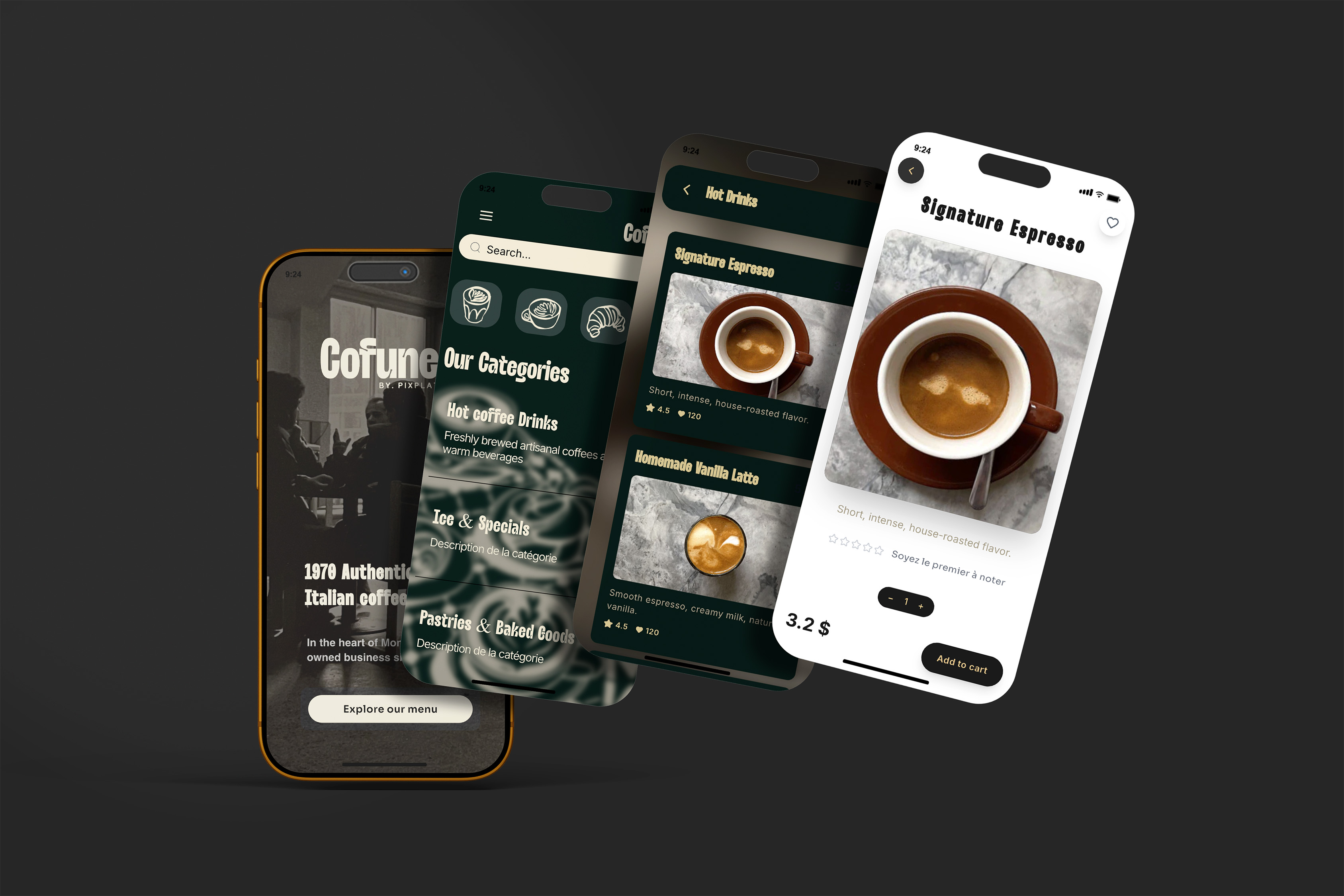
Why café menus have different requirements than restaurant menus
The constraints that shape a good café menu template come directly from how customers experience a café, and they differ from restaurant contexts in four specific ways.
Speed over depth. Cafés thrive on speed and efficiency. During the morning rush, customers need to make decisions fast. A menu that is easy to scan — with obvious sections, bold drink names, and visible pricing — shortens the queue and keeps operations running smoothly. A template designed for depth (long descriptions, extensive photography, multiple sub-categories) creates friction exactly where a café needs flow.
Drinks before food. In a café, beverages are the primary purchase and the highest-margin item. Beverages typically carry higher margins than food and drive repeat visits. Someone might try a new café for the pastries, but they come back for the coffee. A template that gives equal visual weight to food and drinks is underselling your core revenue driver.
Frequent seasonal updates. The defining characteristic of a successful café menu in 2025 is freshness. Limited-time seasonal drinks — pumpkin lattes in autumn, cold brew frappes in summer, matcha specials when the trend is hot — create urgency, social sharing, and repeat visits. Limited-time seasonal drinks drive repeat visits, especially when offered as rotating or limited-time specials that invite experimentation and sharing. A template that is difficult to update inhibits this strategy entirely. A café that cannot rotate a seasonal section easily will either skip the update or spend disproportionate time on it.
Mobile-first in a distracted context. Most café QR scans happen while the customer is simultaneously paying attention to the room, their companion, or their queue position. The menu has to work with divided attention — at a glance, with no reading required to understand the category structure.
The five non-negotiable structural requirements for a café template
Before evaluating any visual attributes, a café digital menu template must satisfy five structural criteria. These are not preferences — they are requirements of the operating environment.
1. Maximum 4–5 category sections visible without scrolling
Keep core sections to 5–7 for most restaurant formats — but for cafés specifically, 4–5 is the right ceiling, because the menu is used in conditions where cognitive load is already high. The typical café category structure that performs well:
Hot drinks
Cold drinks
Seasonal / specials (the update section — see below)
Food and pastries
Extras (syrups, sizes, add-ons — optional)
Any template that requires more than two taps to access the main category overview is wrong for a café context.
2. Drink names legible at a scan — no reading required
Item names on a café menu are different from item names on a restaurant menu. "Oat milk flat white", "Iced brown sugar latte", "Cold brew tonic" — these are short, specific, and self-describing. A template with generous item name typography (16–18px minimum on mobile) allows a customer to read a drink name in under a second. A template that buries drink names in small text alongside long descriptions does not.
3. A dedicated "Specials" or "Seasonal" section that updates easily
This is the single most operationally important feature of a café template. A template with a fixed, re-labelable top section — something you can rename "This week's specials" or "Autumn menu" and fill with 3–5 rotating items — gives you the promotional agility that drives engagement and repeat visits without restructuring the entire menu.
Limited-time menus create 14% more order urgency than static menus. A dedicated seasonal section amplifies this effect by making the new items immediately visible — customers see the rotating section before they see anything else.
4. Photo support for drinks without requiring photos for everything
Strong drink photography drives orders. Menus with professional photography increase sales by 20–45%. But a café with 35 items does not need — and cannot always produce — a photo for every item. The right template supports optional photography per item, not required photography. This allows you to photograph your 5–8 highest-margin and most visually striking drinks and leave standard items as text-only.
The ideal template for a café places one hero photo at the top of each category (usually the seasonal special or the bestseller) and renders all remaining items cleanly in text.
5. Mobile rendering that works for queuing and table users simultaneously
A café QR code may be scanned by a customer at the counter while standing (quick scan, quick decision) or at a table while sitting (slightly longer browse). The template must serve both contexts. This means: fast load time (under 2 seconds on mobile data), no modal pop-ups or splash screens that interrupt access, and a category navigation that works with one thumb.
The four template styles that work for cafés — and which concept fits each
Different café concepts have different visual registers. The right style is the one that matches the physical experience your café creates, not the one that looks most attractive in a screenshot.
Minimal and clean White or off-white background, clean sans-serif typography, limited or no photography except for seasonal specials. Signals quality, focus, and confidence in the product itself. Works for: specialty coffee shops, third-wave concepts, pour-over focused cafés, Japanese-influenced minimalist concepts. The risk: too sparse can feel cold. Counter this with warm colour accents (cream, soft amber) and generous font sizing.
Warm and artisanal Earthy tones, cream backgrounds, hand-crafted visual cues, possibly a textured background element. Signals neighbourhood café character, authenticity, and personal touch. Works for: independent neighbourhood cafés, farm-to-table adjacent concepts, bookshop-cafés, community hubs. Template priorities: readable script or mixed-font headings, warm photography, a seasonal section that always has at least one image.
Contemporary and bold Strong contrast, clear grid structure, one dominant brand colour, photography used strategically. Signals energy, confidence, and a clear brand identity. Works for: fast-growing independents, multi-location café groups, urban commuter concepts. Template priorities: fast load, instant category access, prominent upsell sections (size upgrades, syrups).
Playful and illustrated Custom icons, hand-drawn style elements, vibrant palette. Works for: youth-oriented concepts, university area cafés, specialty dessert-adjacent cafés, concept stores that include a coffee bar. Template priorities: icons per category rather than photography, readable item names at small sizes, visual consistency across all illustrated elements.
Café concept | Recommended template style | Critical feature |
|---|---|---|
Specialty / third-wave coffee | Minimal and clean | Fast load, text-first |
Neighbourhood independent | Warm and artisanal | Seasonal section prominent |
Multi-location urban chain | Contemporary and bold | Category navigation instant |
University / youth-focused | Playful and illustrated | Icons, vibrant accent colour |
Bookshop or cultural café | Warm and artisanal | Long dwell time friendly |
Counter-service focused | Contemporary and bold | Drink names at maximum size |
How to structure your café's digital menu within any template
Template choice is the container. The content structure inside that container determines performance.
Lead with drinks, always. Your hot drinks section should be the first category. Within it, your most ordered or highest-margin drink leads the list. Eye-tracking research shows diners scan menus sequentially — so placing profitable items and categories first increases the chance they're noticed and ordered.
Keep the food section secondary. Food items increase average order value, but they are not the primary search intent for a café customer. Adding food to your coffee shop menu increases average order value and gives customers more reasons to visit throughout the day — not just for their morning drink. Position food as a complement, not an equal. A dedicated food section after drinks, with 4–8 items maximum, performs better than a food section that competes visually with the beverage offering.
Use the seasonal section as your top category. Placing "Today's specials" or "Autumn drinks" above your standard categories means every customer sees it first, regardless of how long they intend to browse. This is the highest-visibility position on a mobile menu — use it for your most margin-friendly and most shareable drinks.
Keep item counts tight. The challenge is building a menu broad enough to capture different customer types but focused enough that your team can execute it during a morning rush. Too many items slow down ticket times. A smaller menu also helps your staff work faster and more accurately. For most café QR menus, 5–8 items per category is the operational and psychological sweet spot.
Seasonal update strategy: how to use your template for year-round freshness
The most commercially effective café digital menus are not static after launch — they are maintained as a live tool that reflects what is relevant right now.
A practical seasonal update rhythm for most cafés:
Season / Period | Update trigger | What to change |
|---|---|---|
New season (4 times/year) | Seasonal ingredient availability | Rename seasonal section; swap 2–3 drinks |
Valentine's / Mother's Day / Easter | Calendar event | Add 1–2 limited-time items to seasonal section |
Summer / Holiday | Weather-driven menu shift | Promote cold drinks to top position within category |
New product launch | Internal decision | Add to seasonal section first; move to permanent if it performs |
Sold-out item | Real-time availability | Remove or mark as unavailable immediately |
Restaurants that update their menus quarterly see 15–30% increases in customer excitement and return rate. For cafés, the update cadence can be more frequent — seasonal specials with a 4–8 week rotation maintain novelty without creating operational disruption.
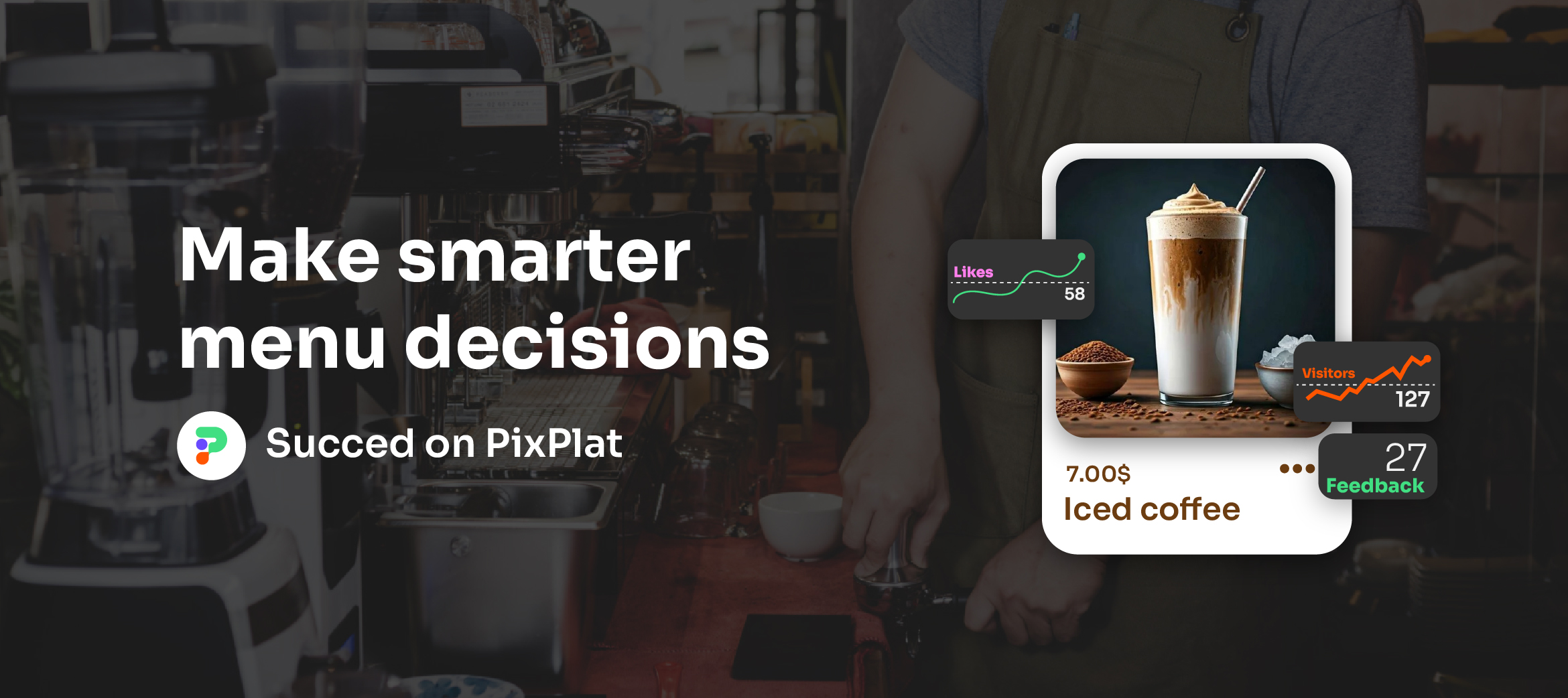
On PixPlat, seasonal updates in a café menu take under 10 minutes: rename the section, swap the items, update photos if available, and the change is live on every table QR code simultaneously. No reprinting, no new QR code, no re-briefing staff.
The most common café digital menu mistakes
1. Using a restaurant template for a café context. Restaurant templates are built for browsing depth. Café customers need browsing speed. A template with 8 categories and scroll-heavy navigation slows down the ordering process exactly when it needs to be fastest.
2. Not having a seasonal/specials section. A café menu without a dedicated seasonal section is a static menu. Static menus do not drive repeat visits or social sharing. This is not a design preference — it is a missed commercial opportunity every day the section is absent.
3. Making food visually equal to drinks. If your food photography is as prominent as your drink photography, and food is positioned at the same level in the template hierarchy as drinks, you are suppressing your highest-margin category. Drinks lead. Food follows.
4. Using a template that loads slowly. A café QR code is often scanned on a mobile data connection by a customer who is already in a queue. Templates with loading times under 2 seconds record 90% completed interactions. A slow-loading menu in a queuing context is a menu that gets abandoned.
5. Launching the template and never updating it. The operating advantage of a digital menu over a chalkboard or printed card is the ability to change. A café that launches a digital menu and doesn't touch it for six months has paid for a static tool and called it dynamic.
Building your café menu on PixPlat
PixPlat's template library includes dedicated café formats — compact, drink-first, with a prominent seasonal section that re-labels and reorders in seconds. The editor's live mobile preview shows you exactly how the menu looks on a phone screen as you build — not after publishing.
For cafés with seasonal specials, PixPlat's real-time update capability means your autumn drinks are live on every table the morning you launch them. For multi-location cafés, a single platform manages all location menus simultaneously, with per-location overrides for pricing or availability.
→ Browse café menu templates on PixPlat
→ For the complete guide to building your digital menu from scratch, see How to create an online restaurant menu
→ For the full template selection framework, see Restaurant menu templates: how to pick the right one
→ For the complete digital menu strategy, see The complete guide to digital menus for restaurants

Frequently asked questions
What should a café digital menu include? The core structure for most café digital menus: a seasonal specials section (first position, 3–5 rotating items), hot drinks (espresso-based, brewed, alternatives), cold drinks (iced coffee, cold brew, blended, non-coffee cold drinks), food and pastries, and optionally an extras section for add-ons and sizes. A comprehensive café menu should include hot beverages, cold drinks, food items, and seasonal specials — with space for allergen information, pricing, and branding elements. The key is keeping each section to 5–8 items and ensuring drinks take visual priority over food.
How often should a café update its digital menu? At minimum, seasonally — four times per year. In practice, the most commercially effective cafés update more frequently: adding a Valentine's Day special in February, rotating a summer cold brew flight in June, promoting a harvest latte in October. Each update creates social media content, reminds regular customers to try something new, and signals to all guests that the café is active and invested in its offering. On PixPlat, these updates take under 10 minutes.
Do café customers actually scan QR codes? Yes — and the scan rate correlates directly with placement and visibility. 60% of all QR code scans in restaurants come from table-mounted codes. For cafés, counter placement adds a significant second channel — a QR code visible to customers while queuing captures browsing decisions before they reach the counter, which reduces queue time and prepares the order. Cafés that brief staff to mention the QR code see scan rates increase by up to 50%.
Should my café have different menus for morning and afternoon? It's a useful approach for cafés that serve meaningfully different offerings across the day — a breakfast menu with pastries and sandwiches in the morning, and an afternoon menu featuring cakes, lunch items, or happy hour drinks. On PixPlat, time-based menu availability allows items to show or hide automatically by time of day, so your morning specials disappear from the menu at noon without any manual action.