Restaurant Menu Templates: How to Pick the Right One
How to choose the best menu template for your restaurant — by concept, format, and business goal. A complete guide to finding, evaluating, and customising templates that actually work.
Restaurant Menu Templates: How to Pick the Right One
Choosing a menu template feels like a design decision. It is actually a business decision wearing design clothes.
The template you pick determines how quickly guests find dishes, which items naturally draw attention first, how your prices feel on screen, and whether the overall experience reinforces or contradicts the impression your restaurant makes in every other way. A mismatched template — technically competent but wrong for your concept — consistently underperforms a well-matched one, regardless of how good the food descriptions are.
A good menu layout can increase sales by up to 15%, simply by making items easier to find and highlighting the right dishes. That 15% doesn't come from beautiful design — it comes from the right structure deployed in the right context. This guide walks you through exactly how to make that choice.
Why most restaurants pick the wrong template
The most common template selection process goes like this: browse a gallery, pick the one that looks most attractive or most relevant to the cuisine type, fill in the content, publish. The result is usually a menu that looks fine and performs poorly.
More than 60% of digital menu boards are done wrong, primarily due to cluttered layouts, poor visual hierarchy, and a mismatch between design style and the actual pace of service the restaurant runs.
The underlying mistake is treating a template as a visual wrapper for content rather than as a structural framework that shapes how guests navigate and decide. Two restaurants serving similar food can produce radically different ordering behaviour from identical content simply by using different template structures.
Before you open a template gallery, you need to answer three questions. What is your service model? What do you need guests to do quickly? And what impression should the menu make before a guest reads a single dish name?
Step 1 — Match the template to your service model
The most important variable in template selection is not aesthetics — it is pace. Your service model determines how much time guests spend with the menu, which determines how much information a template can carry before it becomes overwhelming.
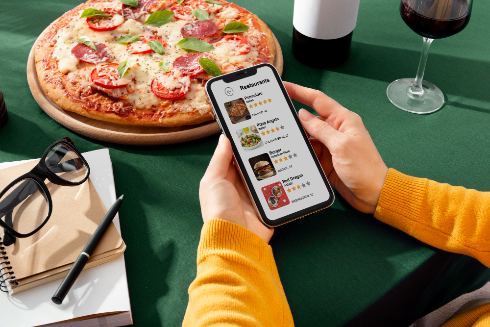
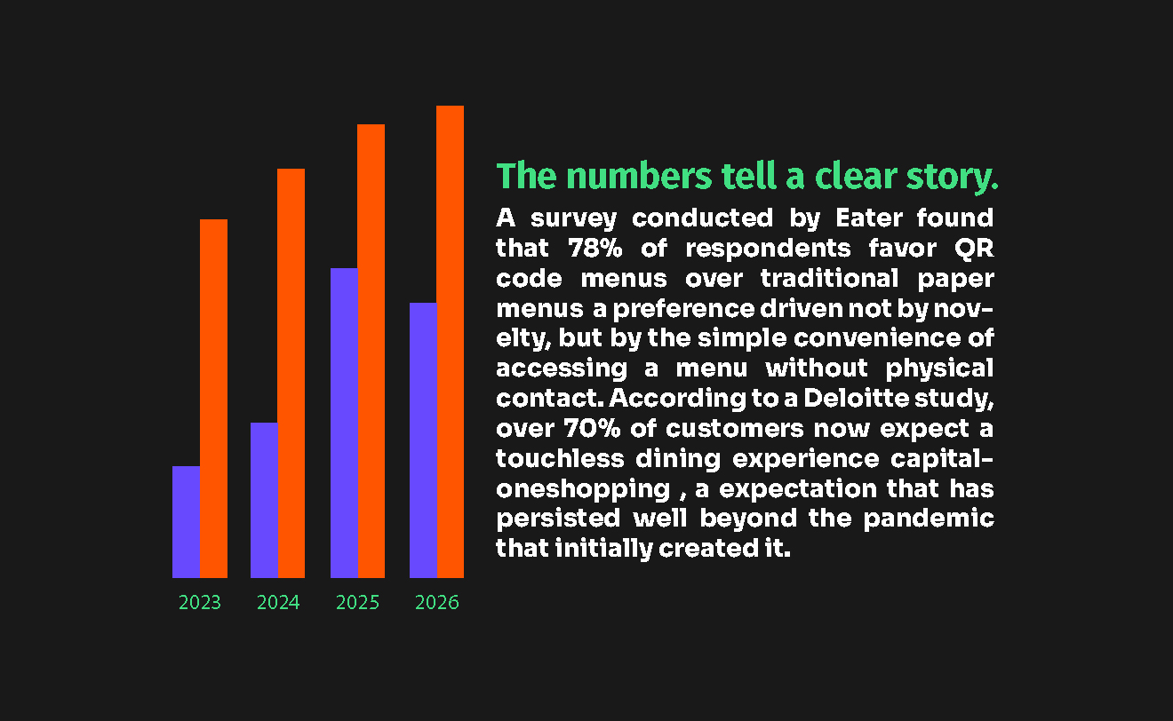
Customers spend an average of only 109 seconds reading a menu before making a decision, and they don't read every word — their eyes follow predictable scanning patterns rather than linear reading. Recodeqr
Here is how service model maps to template requirements:
Service model | Menu dwell time | Template priority | What to avoid |
|---|---|---|---|
Quick service / fast casual | 20–45 seconds | Instant visual clarity, 3–5 categories max, prominent photos on key items | Complex multi-column layouts, long descriptions, many subcategories |
Casual dining | 60–120 seconds | Clear hierarchy, good balance of photos and text, navigable categories | Over-designed headers that slow scanning, menus with 50+ items on screen |
Full service / bistro | 90–180 seconds | Can carry more depth — sections, descriptions, wine list | Cluttered layouts, poor contrast in dim lighting, insufficient white space |
Fine dining | 3–10 minutes | Minimal, elegant, generous white space, few items per section | Heavy use of photos (often none), excess typography styles |
Bar / cocktail lounge | 30–90 seconds | Visual-forward for drinks, creative category naming | Overly text-dense, traditional food-menu layouts applied to drinks |
Food truck | 10–25 seconds | Ultra simple — 5–8 items max, bold text, instant readability | Anything requiring scrolling or multiple taps to see all items |
The practical test: stand at the entrance to your restaurant and imagine a guest who has just sat down. How quickly do they need to be ready to order? That speed determines how much a template can ask of them visually.
Step 2 — Define the visual identity your template must carry
A template is not brand-neutral. Every template has a visual personality — warm or cool, playful or austere, casual or refined. Before evaluating specific templates, define what visual signals your restaurant needs to send, because no amount of customisation can fully override a template's underlying character.
Consistent branding across all customer touchpoints increases revenue by an average of 23%. Your menu is one of the most-touched brand assets you have — it must reinforce, not dilute, the impression guests form from your space, your staff, and your food.
The four visual registers and what templates carry them:
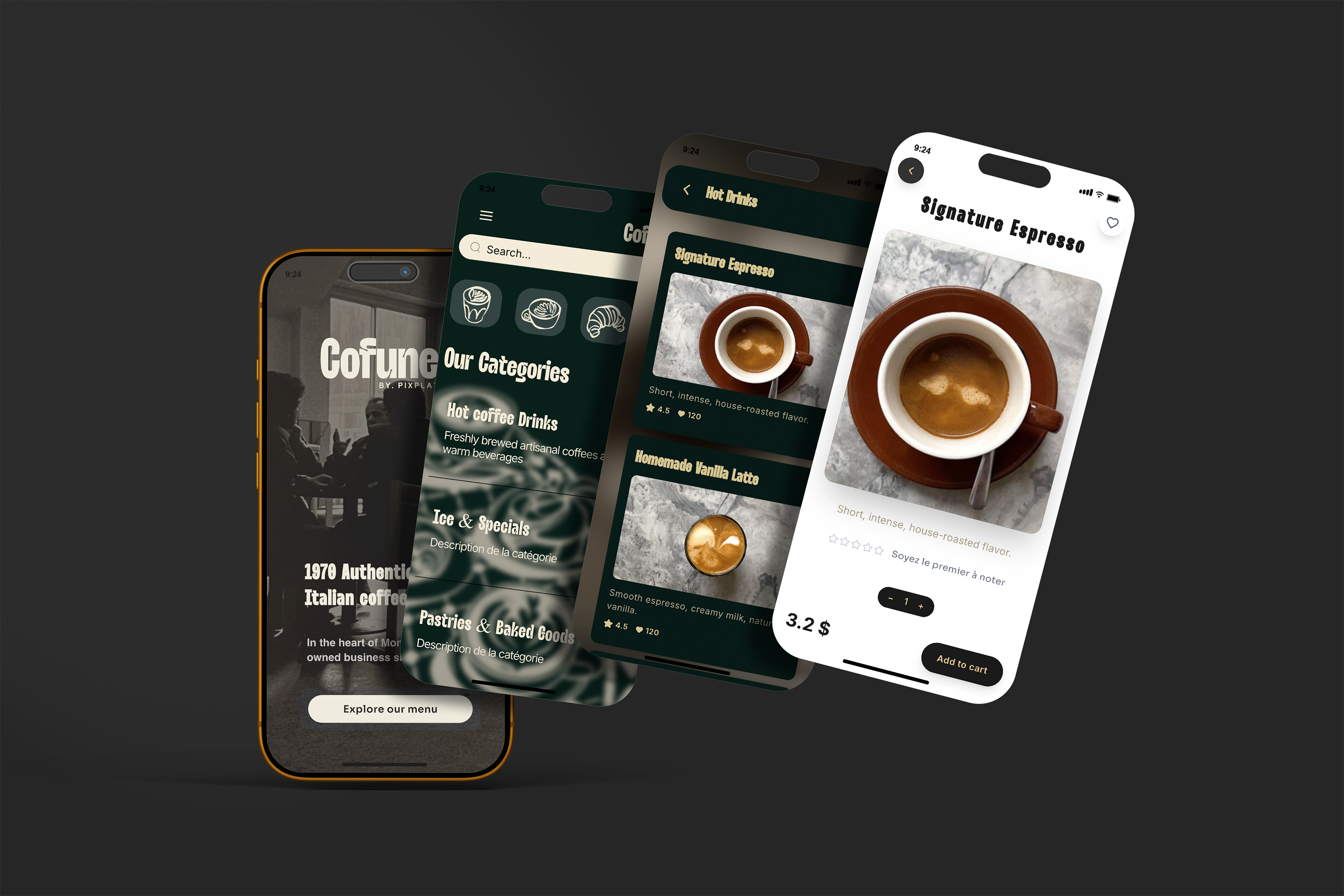
Minimal and refined — white space dominant, limited colour, serif typography, few or no photos. Signals quality, confidence, and premium positioning. Right for fine dining, wine bars, omakase, tasting menus. Wrong for any concept where speed, variety, or fun is the selling point.
Warm and artisanal — earthy tones, slight texture, hand-crafted visual cues, script accents. Signals authenticity, locality, care. Right for farm-to-table, neighbourhood bistros, artisan cafés, brunch-focused concepts. Wrong for concepts that need urgency or a contemporary urban feel.
Bold and energetic — strong contrast, warm accent colours (red, amber, orange), prominent photography, clear sans-serif type. Signals appetite, energy, and immediacy. Right for casual dining, fast casual, burger concepts, pizza, Mexican. Wrong for fine dining or any concept where restraint is part of the brand.
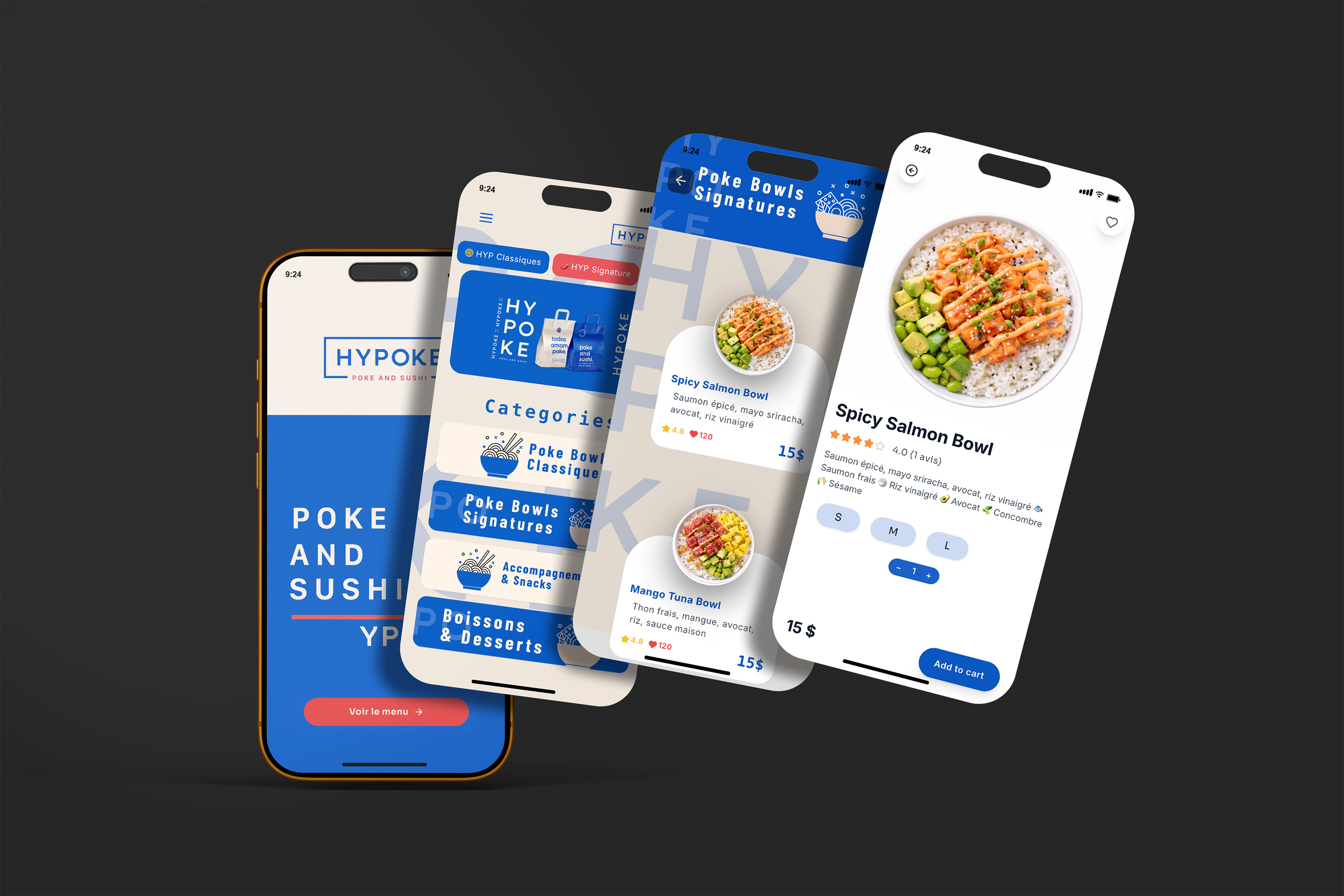
Contemporary and sleek — cool neutrals, geometric structure, photography in tight grid layouts, clean modern type. Signals innovation, sophistication without formality. Right for modern Asian cuisine, upscale cocktail bars, Nikkei or fusion concepts. Wrong for warm family-style or traditional comfort food.
Test your current restaurant against these descriptions. The template register should match — and if you're uncertain, look at three restaurants you admire in your segment and notice what visual register they use.
Step 3 — Evaluate these six structural criteria before committing
Once you have narrowed to templates that match your service model and visual register, evaluate each remaining option against these six structural criteria. These are the factors that drive performance, not preference.
1. Category visibility on mobile without scrolling On a digital menu, the first screen a guest sees — before any scrolling — is where their attention is highest. A template that requires two or three scrolls before a guest can assess the full category list loses engagement early. Your categories should be visible as a navigation element at the top, or as clearly delineated sections that are immediately apparent on load.
2. Item density per screen Consumer psychology research consistently supports limiting each category to 6–10 items. Beyond 10 items per category, cognitive load increases sharply and guests default to the cheapest or most familiar option rather than exploring. A template that places 15 items visible on screen simultaneously is working against your revenue. Evaluate how many items are visible at once and whether the template structure reinforces or undermines focused decision-making.
3. Visual hierarchy for high-margin items The best template is not one that treats all items equally — it is one that makes it easy to elevate your stars. Research by menu consultant Aaron Allen and Associates shows that guests' eyes first move to the centre of a menu, then the top right, then top left — the "golden triangle." Supercode On a digital menu, the first visible item in the first category is the top-right equivalent. A good template allows you to feature or badge specific items, use a slightly larger card, or place them in a visual anchor position. If a template offers no way to differentiate your highest-margin item from any other, it is the wrong template.
4. Photo handling for your specific situation Templates handle photography in radically different ways — some require a photo for every item, some support optional photos per item, some are photo-first with text secondary, and some are text-primary with photo as optional accent. Choose based on your photography reality, not your aspiration. If you have excellent photos for 10 dishes and nothing else, a template that requires photos for every item will either look incomplete or pressure you into using bad photos. A word of caution: don't use mediocre photos on your menu. Better to use no photos than bad ones — including high-quality photos alongside food items increases sales by 30%, while poor photos can actively reduce perceived food quality. Restaurant Business Online
5. Typography legibility under your actual lighting conditions This is the test most restaurants skip. Open the template on your phone, stand in your dining room at service time, and read it under your ambient lighting. Restaurant lighting is designed for atmosphere, not readability. A template that looks elegant under white office light can become nearly unreadable at 8pm under your warm ambient lamps. The contrast ratio of the text against the background must hold under your conditions — and many elegant template colour combinations fail this test.
6. Update speed and maintenance fit A template you cannot update easily will be updated rarely. Restaurants that update their menus quarterly see 15–30% increases in customer excitement and return rate. If updating a seasonal special on your chosen template requires repositioning six elements, you will avoid updating. Choose a template where a price change or dish swap takes under two minutes — and verify this before committing.
Step 4 — The template selection matrix by restaurant type
Use this matrix to shortlist templates based on your concept. These are evidence-based recommendations, not aesthetic preferences.
Concept type | Template structure | Photo approach | Category depth | Key differentiator |
|---|---|---|---|---|
Fine dining | Single column, generous spacing, minimal borders | None, or 1 editorial hero image | 4–6 sections, 4–7 items each | White space as a quality signal |
Bistro / brasserie | Two-column for mains, single column for wine/drinks | Optional per item, 30–50% coverage | 6–8 sections | Warm colour palette, readable at dim light |
Café / coffee shop | Compact grid for drinks, list for food | Photo per drink category, optional for food | 3–5 sections | Instant readability for queuing customers |
Casual dining | Card-based layout, swipeable categories | Photo on all main items | 6–10 sections | Bold category headers, photo anchor |
Fast casual / QSR | Flat list with strong visual separation | Photo on every item or none | 3–6 sections, 5–8 items | Zero visual confusion, clear pricing |
Food truck | Single scrollable list | 3–5 hero photos max | 2–3 sections | Biggest possible item name at top |
Bar / cocktail lounge | Split layout: drinks primary, food secondary | Photo per cocktail category | 4–6 drink sections, 2–3 food | Cocktail names dominant |
Tasting menu | Minimal, course-by-course linear flow | Optional editorial imagery | 5–8 courses listed in sequence | Course numbering, no price column confusion |
Step 5 — How to customise a template without breaking its structure
The most common customisation mistake is using a template as a starting point and then progressively adding elements until the underlying structure no longer functions. Every addition has a cost — in load time, in visual attention, and in maintenance complexity.
The right customisation sequence:
Start with brand colours. Replace the template's colour palette with your own, but test every combination for contrast ratio (minimum 4.5:1 for body text). If your brand's primary colour is light or warm-toned, use it only for accent elements like category headers or badges — keep body text dark on light.
Replace the typography. Swap to your brand's fonts or a matching pair. Follow the two-font rule: one for headers, one for body. If your brand uses a decorative typeface, confine it to section headers. Never use it for item descriptions or prices.
Choosing a font for your logo or website design requires matching font character to the brand personality — a bold geometric sans-serif on a fine dining menu creates a disconnect; a flowing script on a fast-casual menu creates confusion. Match font character to restaurant character first, then optimise for readability.
Add your logo and hero image. Position your logo at the top of the menu — this is the first trust signal when a guest opens a QR menu. If the template supports a hero banner or section image, use a single strong photography decision here rather than adding photos everywhere.
Customise section names. Default template section names like "Starters" and "Mains" are functional but generic. Rename them to match your voice — "To begin", "From the wood oven", "From the garden", "Small plates to share." This adds personality without touching the structure.
Resist the urge to add more sections. Most templates perform best within their designed category range. Adding sections because your menu is complex is the wrong solution — the right solution is simplifying your menu, not expanding the template.
→ For guidance on how to structure your categories to maximise ordering behaviour, see How to structure your menu categories to increase restaurant sales
→ For how to choose your fonts and colours before customising, see Fonts and colours that make a restaurant menu look professional
Step 6 — Test before going live
A template that works in the editor may not work in practice. Run this test protocol before publishing:
Open the menu on your actual phone (not the editor preview). Walk through the experience as a first-time guest: can you find the key categories in under 10 seconds? Can you read a dish description without zooming? Does the menu feel consistent with the rest of your restaurant's identity?
Then hand your phone to a team member who has not been involved in the design process. Ask them to find your most profitable dish. Time them. If it takes more than 15 seconds, the template structure or category naming needs adjustment.
Finally, open the menu on an older Android device if you have access to one. Template rendering can differ significantly between flagship iPhones and mid-range Android devices — especially around custom fonts, image loading, and scroll behaviour. If it breaks on an older device, it will break for a non-trivial portion of your guests.
PixPlat's template library — built around this logic
PixPlat's template library is organised by restaurant concept, not by visual style. Each template has been built to meet the structural criteria above: category visibility on the first screen, item density within the 6–10 item range per section, mobile-first rendering, and a customisation system that keeps brand colours, typography, and logo updates to under five minutes.
Every template generates a QR code automatically on publish, and all customisations update live — a price change in the editor is visible to a scanning guest within seconds, with no republishing step.
→ Browse PixPlat's templates and start building your digital menu → Start your first menu for free — no credit card required
Next steps from this hub
This article covers the decision framework for choosing a template. The PixPlat blog covers the downstream decisions in dedicated guides:
Best digital menu templates for cafés and coffee shops — what works specifically for café concepts, from counter menus to table QR menus
Digital menu template for food trucks — lean menus, bold layouts, and the specific constraints of the truck context
Fine dining menu template: what actually works — the restraint-first approach to premium menu design
How to customise a menu template to fit your restaurant brand — step-by-step personalisation guide
How to create an online restaurant menu: step-by-step — the full creation guide for building your menu from the ground up
Frequently asked questions
Does the template matter more than the menu content?
Both matter, and they interact. Excellent content in a poorly matched template underperforms. Mediocre content in a well-matched template still underperforms. The relationship is multiplicative, not additive — a template that guides attention toward your best dishes amplifies good content, and undermines bad content faster. Start with honest content and a structurally sound template before worrying about visual refinement.
Can I switch templates after publishing my menu? On PixPlat, yes — you can switch templates without rebuilding your content. Your dishes, descriptions, photos, and prices transfer to the new template. The category structure may need minor adjustments if the new template handles sections differently, but no content is lost. This means you can test templates in practice, not just in the editor.
How many templates should I test before committing?
Two or three is sufficient if you have followed the selection framework above. Template testing without a framework produces indecision — you will always find something slightly more attractive. Use the six structural criteria as the test, not visual preference, and you will converge on the right choice quickly.
Should my digital menu template match my printed menu?
They should share the same visual register — fonts, colours, general tone — but the structural decisions can differ. Print menus are read in a single format; digital menus are scrolled and tapped on variable screen sizes. A template that works on a printed bi-fold may not translate well to mobile. Think of them as siblings, not twins — same family, different needs.