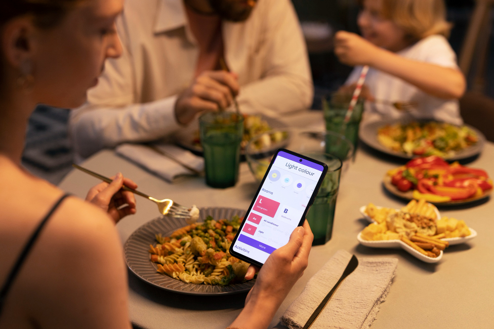
Restaurant Menu Analytics: Understanding Your Customers
What your digital menu data reveals about guest behaviour — the metrics that matter, benchmarks to compare against, and how to turn insights into menu decisions.
Restaurant Menu Analytics: Understanding Your Customers
A paper menu tells you nothing. It sits on the table, guests read it, and every signal about what they considered, hesitated over, compared, and rejected disappears the moment they order. The only data that survives is the order itself — the final answer, with none of the reasoning.
This is the fundamental blindness of running a restaurant on POS data alone: you know what sold, but you have no idea what almost sold. You can't tell which dishes guests look at most, even if they don't order them, what time of day certain categories get the most attention, whether a new special is actually being seen, or how long guests spend browsing each section. Without this information, optimising your menu is largely guesswork dressed up as experience.
Restaurant menu analytics closes that gap. Every interaction with a digital menu generates behavioural data — views, dwell time, navigation paths, filter usage — that reveals guest intention before it becomes (or fails to become) an order. This hub covers what your menu data can tell you, the metrics worth tracking, the benchmarks to compare against, and the weekly practice that turns numbers into menu decisions.
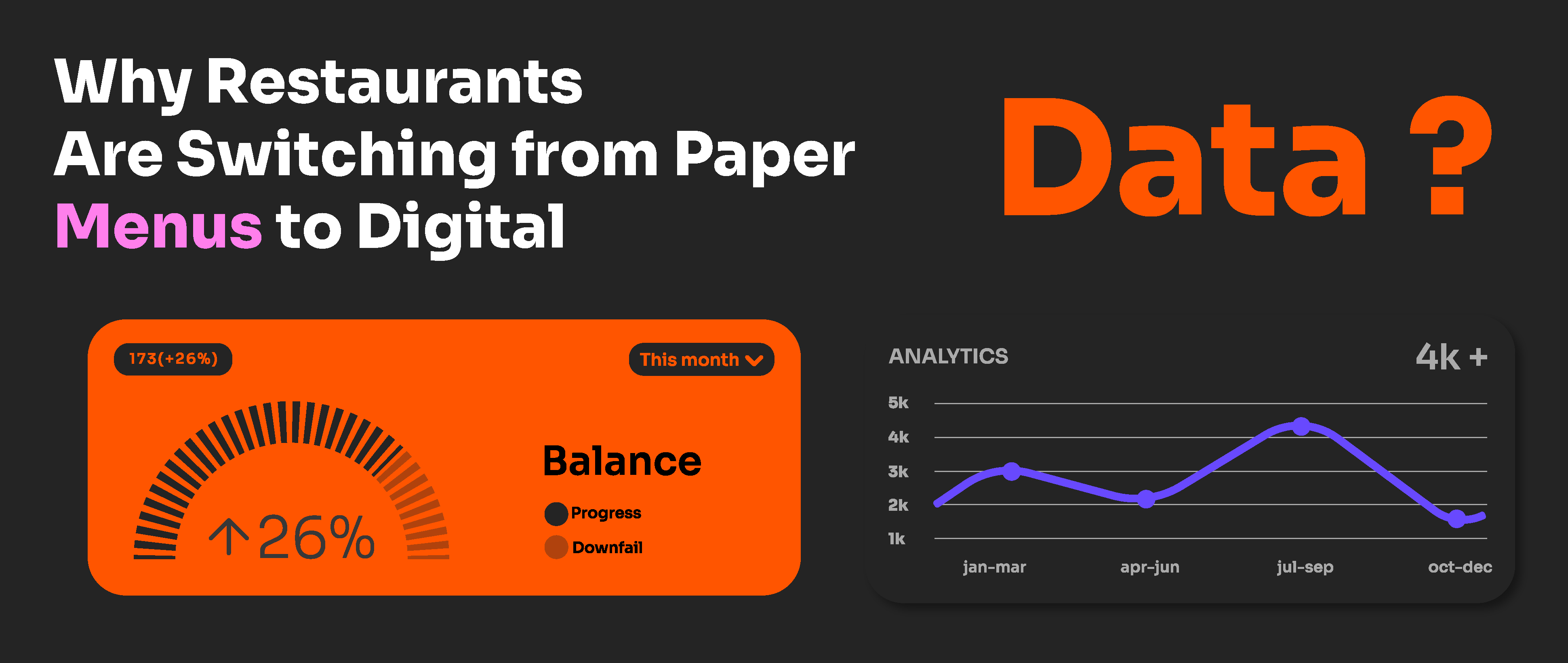
What menu analytics sees that your POS can't
Your POS records transactions. Your menu analytics records consideration — and the difference between the two is where the insight lives.
Think of the guest journey as a funnel: scan → browse → view items → decide → order. The POS only captures the final step. Menu analytics captures everything upstream:
Funnel stage | What menu analytics captures | What it reveals |
|---|---|---|
Scan | When, where, which QR code | Traffic patterns, placement performance |
Browse | Time on menu, sections visited | Engagement depth, navigation friction |
View | Item-level views, photo taps | Interest and consideration per dish |
Decide | Dwell time per item, filter usage | Hesitation, dietary needs, comparison behaviour |
Order | (Joins with POS data) | Conversion — the ratio of interest to action |
The most valuable insight comes from the gap between stages. A dish with high views and low orders is not a POS insight — the POS just shows a dish that doesn't sell. Menu analytics shows a dish that attracts attention and then loses it — which is a completely different problem with a completely different fix: the description, the photo, or the price is failing at the moment of decision, not the concept.
This distinction — intention data versus transaction data — is the reason menu analytics deserves its own practice rather than being a footnote to your POS reports. Every interaction with a digital menu generates valuable information: most clicked dishes, average decision time, seasonal preferences — insights that allow optimising inventory, planning targeted promotions, and even conceiving new dishes based on emerging patterns.
The six metrics that matter — and their benchmarks
Menu analytics platforms can generate dozens of data points. Six carry most of the decision-making value. Cross-restaurant benchmark data gives you a reference point for each:
Metric | Below average | Average | Excellent |
|---|---|---|---|
Scan rate per cover | <40% | 60–75% | >85% |
Average time on menu | <90 sec | 2–4 min | 4–6 min |
View-to-order ratio (median dish) | <0.4 | 0.5–0.7 | >0.7 |
Allergen/dietary filter usage | <3% | 5–10% | >10% |
Photo coverage (% of dishes with photos) | <30% | 50–70% | >85% |
Multilingual usage (tourist areas) | <15% | 25–35% | >40% |
Suggested chart type: horizontal bullet chart comparing your restaurant's metrics against the three benchmark bands
Scan rate per cover — the share of tables that scan at least one QR code. A good scan-to-table ratio is 40–80%; if you serve 100 tables a day and see 50–80 scans, that's normal. Below 40% signals a placement, size, or awareness problem — fix the physical deployment before drawing any conclusions from the rest of your data, because low scan volume makes every other metric unreliable.
Average time on menu — how long guests browse. This metric is context-dependent: very short times can mean either instant clarity (regulars who know what they want) or instant abandonment (slow loading, confusing structure). Read it alongside your load speed and bounce behaviour. Menus loading in under 2 seconds record 90% completed interactions; anything slower bleeds engagement before the first dish is seen.
View-to-order ratio — the single most actionable metric in menu analytics. Dishes that get viewed often but ordered rarely are description, photo, or pricing problems with clear fixes. A dish sitting below 0.4 while its section peers sit at 0.6 is your highest-priority rewrite.
Allergen and dietary filter usage — this tells you about your guest population in ways no other data point can, including, often, that you have far more allergy-conscious guests than you assumed. Filter usage above 10% is a strong signal to expand and badge your dietary options prominently.
Photo coverage correlates directly with engagement and conversion, and multilingual usage in tourist areas tells you whether your language options match your actual guest mix.
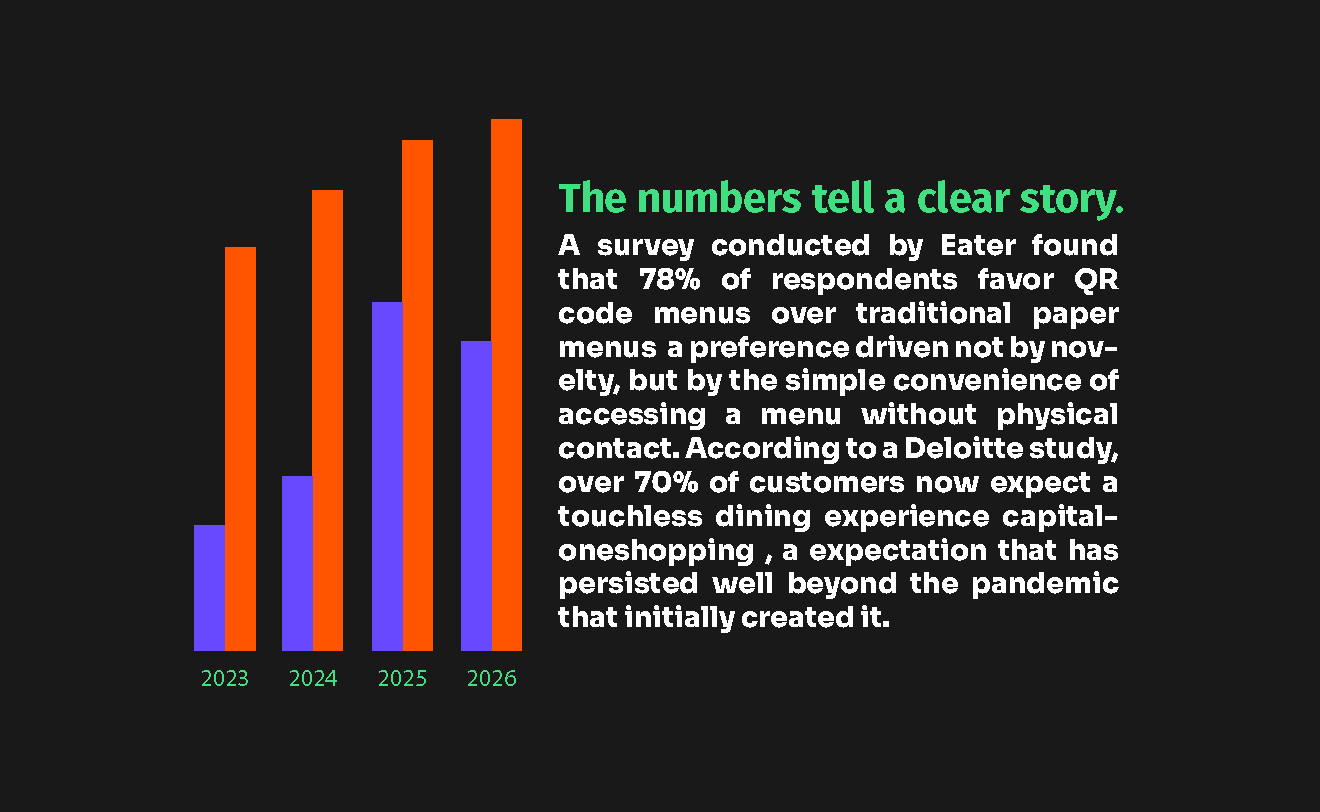
Reading the data: five signals and the action each one triggers
Metrics only matter if they change what you do. Here are the five most common patterns in menu analytics data, and the specific action each should trigger.
Signal 1 — High views, low orders on a specific dish.
The dish attracts interest and loses it at decision point. Action: rewrite the description with sensory specificity, replace or add the photo, or reassess the price against neighbouring items. Then measure the same ratio two weeks later. This single loop — spot, fix, remeasure — is the core practice of menu engineering with behavioural data.
Signal 2 — A section with consistently short dwell time.
Guests enter the section and leave almost immediately. Either the section name misleads (guests expected something else), the first items are weak anchors, or the section is buried too deep in the navigation. Action: rename the section, move your strongest item to first position, or promote the section higher in the menu order.
Signal 3 — Peak scan times that don't match your prep schedule.
If scans spike at 12:30pm and 7:00pm, those are your rush windows; a dead zone from 3–5pm is your opportunity for happy hour promotions. Action: schedule menu updates and specials to go live before peak windows, and target promotions at the dead zones. Knowing your peak browsing times also helps anticipate busy periods for staffing and inventory.
Signal 4 — High filter usage on a dietary category.
Guests are actively searching for vegan, gluten-free, or allergen-safe options. Action: audit whether your offering matches the demand the filters reveal — and make dietary badges more prominent so filtered guests find their options in one tap rather than three.
Signal 5 — One QR placement dramatically underperforming others.
If your table codes generate strong traffic but your entrance code barely registers, the placement — size, height, visibility — is failing, not the concept. Action: fix the physical variables before concluding guests "don't scan outside."
→ For the placement variables that drive scan rates, see Where to place QR codes in your restaurant to maximise scans
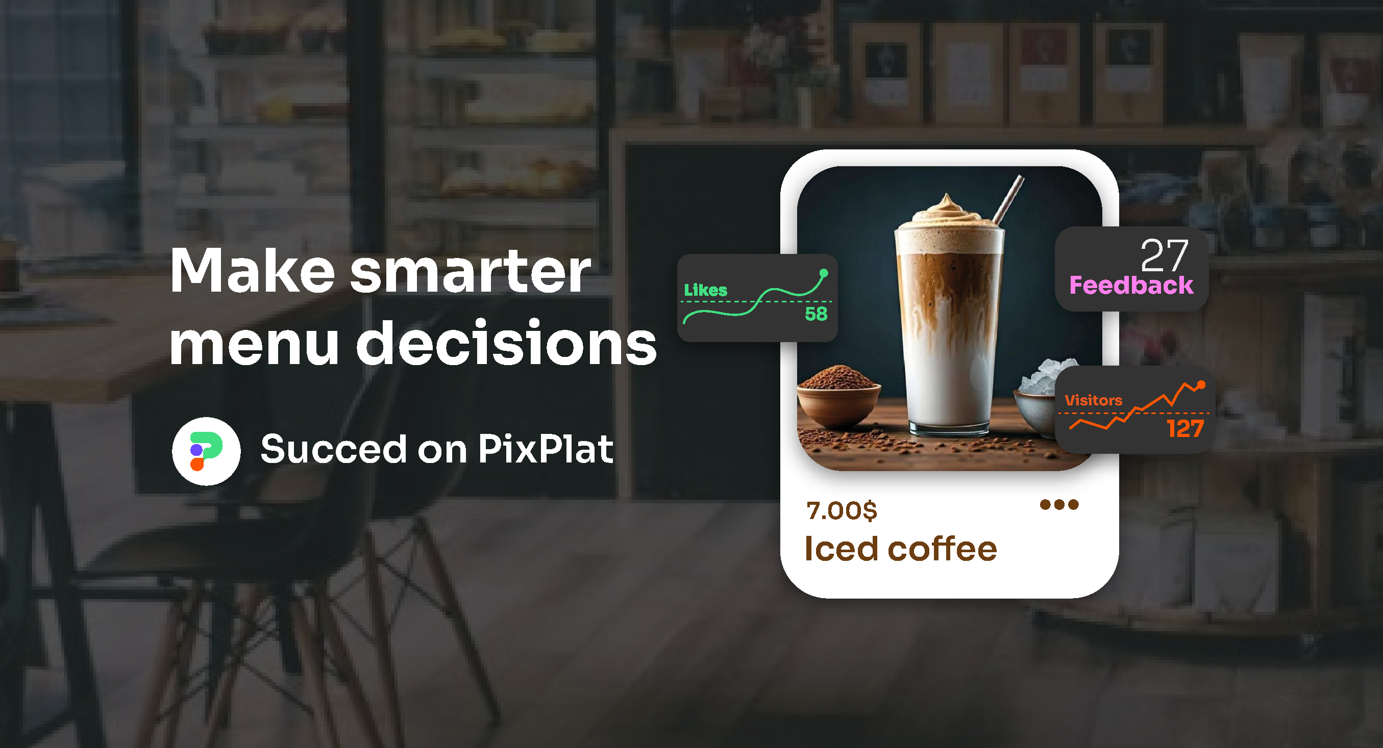
The weekly five-minute review: the cadence that compounds
The biggest analytics mistake restaurants make is not ignoring data — it's reviewing it quarterly. The weekly cadence is the one that compounds: most operators do a quarterly review and miss most of the value, while a five-minute weekly check catches small problems before they become permanent menu features.
Operators who review their QR menu analytics weekly typically lift average check size 8–14% within 90 days, purely from data-driven menu engineering — no new dishes, no price increases, just systematic response to what the data shows.
The weekly five-minute routine:
Scan volume vs last week — trending up, flat, or down? Sudden drops usually mean a physical problem (damaged QR code, moved table tent), not a demand problem.
Top 5 and bottom 5 viewed items — any changes from last week worth noting?
The worst view-to-order ratio in the top 10 most-viewed items — this is your one fix for the week.
Peak time check — did your specials and updates go live before the rush windows?
One experiment check — if you changed something last week, did the metric move?
That last point deserves emphasis. Many restaurant decisions are made around assumptions — "we should promote cocktails," "guests probably don't read long descriptions" — then somebody updates the menu, sales move, and nobody knows why. The discipline of changing one thing at a time and checking the metric the following week is what separates analytics-driven menu management from redecorating.
Don't over-read daily fluctuations. A single slow Tuesday means nothing; four slow Tuesdays in a row means you need a Tuesday promotion. Run your menu for 2–4 weeks to establish a baseline before making changes, then evaluate weekly trends against it.
From menu data to business decisions
Menu analytics starts as a menu optimisation tool. Used consistently, it becomes an input to decisions well beyond the menu itself.
Inventory and prep forecasting. Item-level view trends are a leading indicator of demand. A dish trending up in views this week is a dish to prep more of next week. One restaurant reduced food waste by 40% through customer preference tracking via its digital menu — because view data flagged shifting demand before the sales data confirmed it.
Pricing decisions. View-to-order ratios by price point reveal your guests' sensitivity thresholds. If dishes above a certain price consistently show high views and low conversion while everything below converts normally, you've found your market's ceiling — empirically, not by guesswork.
Menu development. Filter usage, section engagement, and view patterns collectively describe what your guests are looking for and not finding. High vegan-filter usage with low vegan-item conversion means guests want plant-based options but yours aren't compelling — a development brief written by your own data.
Multi-location comparison. For groups, the same dish performing differently across sites is a local-preference signal: a bestseller downtown that barely moves in the suburbs is a local-layer menu decision waiting to be made. Cross-site view data turns anecdote into evidence.
Staffing and service flow. Peak browsing windows refine your staffing curve, and per-table scan timing can even reveal service patterns — tables that browse long and order late may signal menu ambiguity or a stretched section.
Privacy: what menu analytics tracks and what it doesn't
A necessary clarification, because "customer data" raises reasonable questions: menu analytics as described here works with anonymous engagement data, not personal identifiers. It counts views, taps, dwell times, and device types — it does not identify who the guest is.
This is GDPR-compliant by design when handled correctly: anonymous engagement data is exactly what the regulation was designed to permit. The practical requirements are modest — a short privacy notice on the menu page and a sensible data retention policy, both of which reputable platforms handle by default. No consent banner is required for anonymous analytics without personal identifiers or ad-tracking pixels.
For guests, the trade is invisible and benign: their anonymous browsing patterns, aggregated with everyone else's, make the menu better — faster to navigate, better photographed, more aligned with what people actually want to order.
How this works on PixPlat
PixPlat's analytics dashboard is built around the funnel described in this guide: scan volume by code and by time, section and item-level views, engagement time, and device breakdown — presented as trends rather than raw tables, so the weekly five-minute review is genuinely five minutes.
Because each QR code is tracked individually, placement comparison works out of the box: table codes, entrance codes, and takeaway codes each report separately. And because the menu itself lives on the same platform, the loop from insight to action is immediate — spot a weak description in the analytics view, fix it in the editor, and the change is live on every table before the next service.
→ For the metrics deep-dive, see Which metrics to track to improve your digital menu performance
→ For acting on dish-level data, see How to see which dishes get the most views on your digital menu
→ For the operational side of applying changes, see Restaurant menu management: updating your menu in real time
→ For the complete digital menu strategy, see The complete guide to digital menus for restaurants
Frequently asked questions
What can menu analytics tell me that my POS reports can't?
Your POS records completed transactions — what sold, when, and for how much. Menu analytics records the consideration phase before the transaction: which dishes guests viewed, how long they hesitated, what they compared, which filters they used, and what they looked at but didn't order. The gap between views and orders is the most actionable data in menu optimisation, and it's invisible to a POS. A dish with high views and low orders has a presentation problem; a dish with low views has a placement problem — the POS shows both as simply "low sales."
How long should I collect data before making menu changes?
Two to four weeks establishes a reliable baseline. Daily fluctuations are noise — a slow Tuesday means nothing, but four consecutive slow Tuesdays is a pattern worth acting on. After the baseline period, shift to a weekly review rhythm: check trends, make one change at a time, and measure the effect the following week. Operators who maintain this weekly cadence typically lift average check size 8–14% within 90 days through incremental, evidence-based adjustments.
Is tracking guest behaviour on my menu legal under GDPR?
Yes, when done correctly — and reputable platforms handle it correctly by default. Menu analytics works with anonymous engagement data (views, taps, timing, device type), not personal identifiers. Anonymous aggregate data is exactly what GDPR was designed to permit. The standard requirements — a brief privacy notice on the menu page and a reasonable retention policy — are built into most platforms. Consent banners are only needed for personal-data tracking like advertising pixels, which a menu shouldn't be running anyway.
What's a good scan rate for a restaurant QR menu?
Benchmark data puts the average at 60–75% of covers, with anything above 85% excellent. For essential-access use cases like digital menus, engagement rates often exceed 70% because the scan is part of the service. If your rate sits below 40%, the cause is almost always physical — code too small, placed flat, poor lighting, or no call to action — rather than guest reluctance. Fix placement first; every other metric depends on adequate scan volume to be meaningful.